
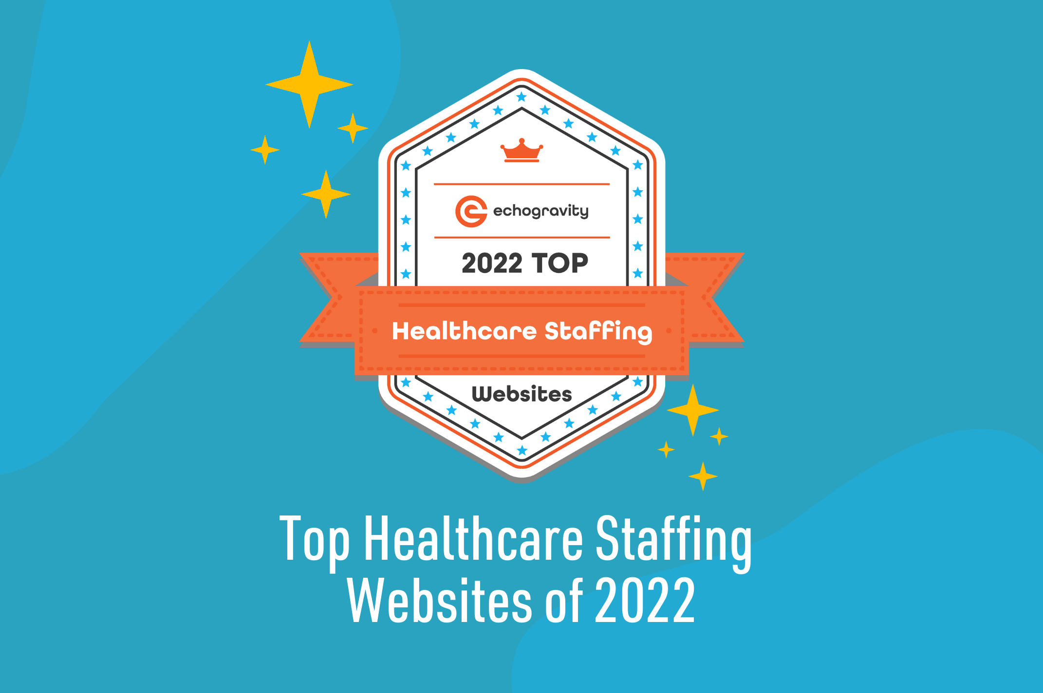
Congratulations to the Top 20 Healthcare Staffing Websites in 2022
In 2021, the healthcare staffing and recruiting industry was valued at $24.1 billion in 2021 and is expected to expand at a compound annual growth rate of 5.6% from 2022 to 2030. In this competitive field, it can be a challenge to stand out and show distinction in the marketplace.
At echogravity, we’re passionate about web design and companies that showcase their brand identities in compelling ways. Especially in the healthcare staffing business, your website is a major factor in setting yourself apart from your competition. An accessible, engaging website is crucial to attracting high-quality candidates and gaining the trust of clients.
This review of healthcare staffing websites aims to provide inspiration and recognize medical staffing and recruiting agencies for their efforts in innovative web design and informative messaging, while also allowing businesses the opportunity to self-assess their own websites. This year, we’ve divided winners into two sections: new winners and 2nd time winners who also won in 2019 and continue to impress us.
We’ve analyzed hundreds of sites and chosen our top 20 websites using the following updated criteria:
- UI/UX — usability, accessibility, and responsive design
- Candidate experience — ample content catered to candidates and easy to use job board
- Innovative design techniques — striking video, animation, illustrations, interactive elements
- Messaging — engaging, audience-centric content with minimal distraction
- Imagery – beautiful, high-res images that align with the brand and highlight services
- Font style — placement and appearance of headers, sub headers, page styling and formatting as a design element
New Winners in 2022
Fusion Medical Staffing
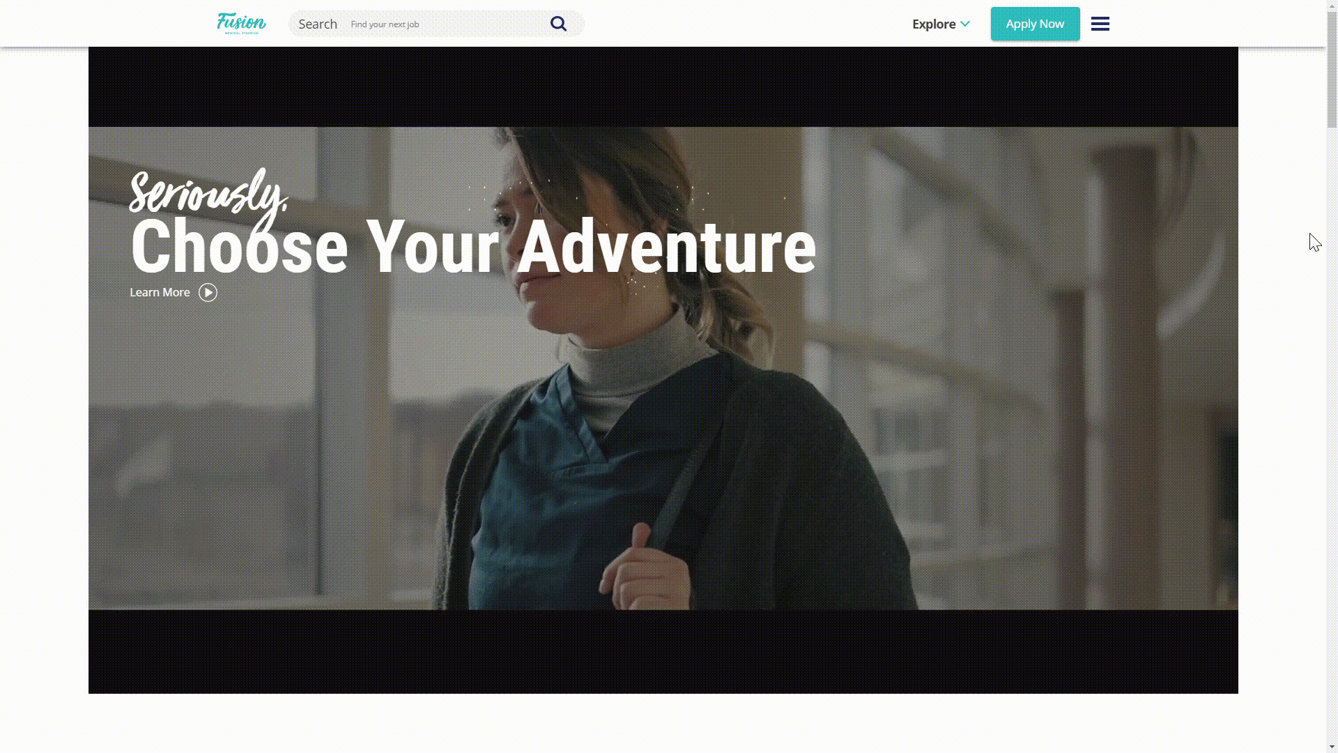
fusionmedstaff.com
- Users are immediately captivated by the short film in the hero section of Fusion’s homepage. We watch as a young healthcare professional wakes up ready for a change. Thanks to Fusion, she’s able to experience a new city and make new friends, all while positively impacting those she works with. Through colorful travel-themed graphics and messaging, Fusion’s flexible, adventurous branding shines. Most notable are the interactive landing pages for the major cities they serve. Choose Chicago, for example, and learn all about what the Windy City has to offer a traveling medical professional.
ProLink Staffing
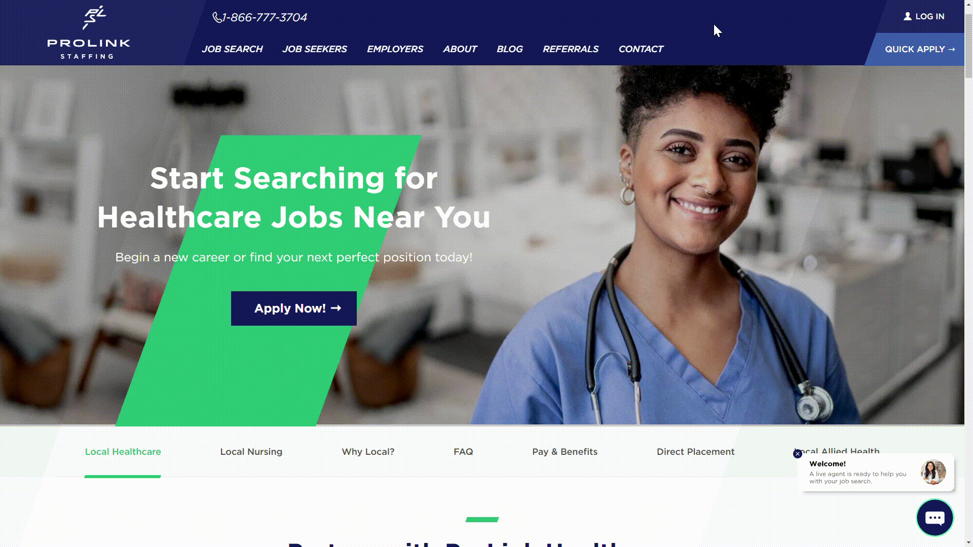
prolinkstaffing.com/healthcare
- Clean, intuitive, and informative are a few words that come to mind when browsing ProLink’s website. By balancing white space with organized sections of text and imagery, the messaging throughout the site stands out. Just by skimming the homepage copy, it’s clear ProLink is a company that is passionate about advancing the careers and companies of those they serve.
The Medicus Firm
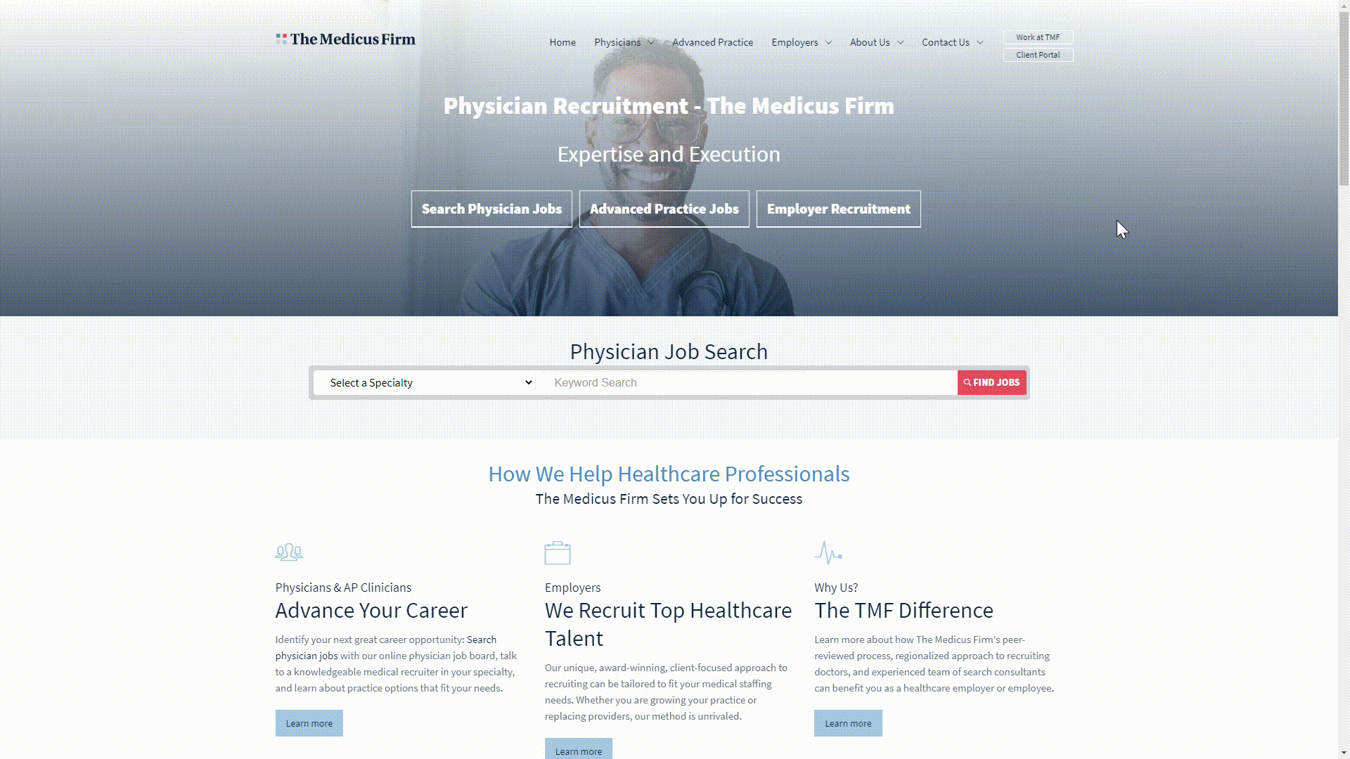
themedicusfirm.com
- There’s a lot of information housed in The Medicus Firm’s website, and they do a fantastic job of organizing it. Whether you’re a jobseeker or in need of healthcare staffing solutions, you’ll be able to quickly navigate to all the information you need. The muted shades of blue and simple imagery throughout the site offer minimal distractions, making it easy to focus on their messaging.
XPRT Staffing
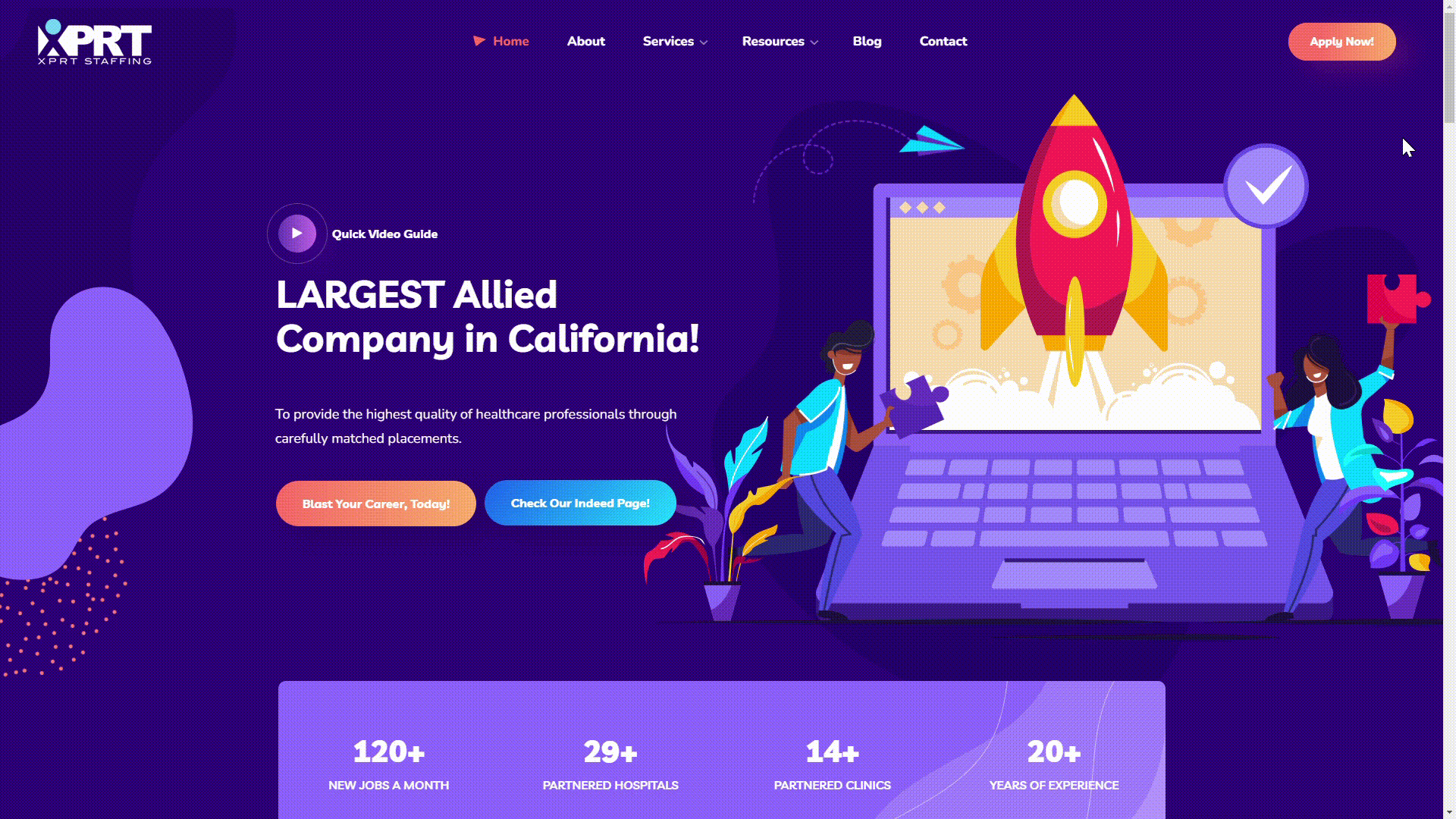
xprtmedstaff.com
- Now this is a fun healthcare staffing website. Bright purples flow throughout the site with pops of orange, yellow, red, and turquoise. XPRT’s whimsical font choice, various animated statistics, and cheeky graphics showcase their brand’s lively personality.
TLC Nursing
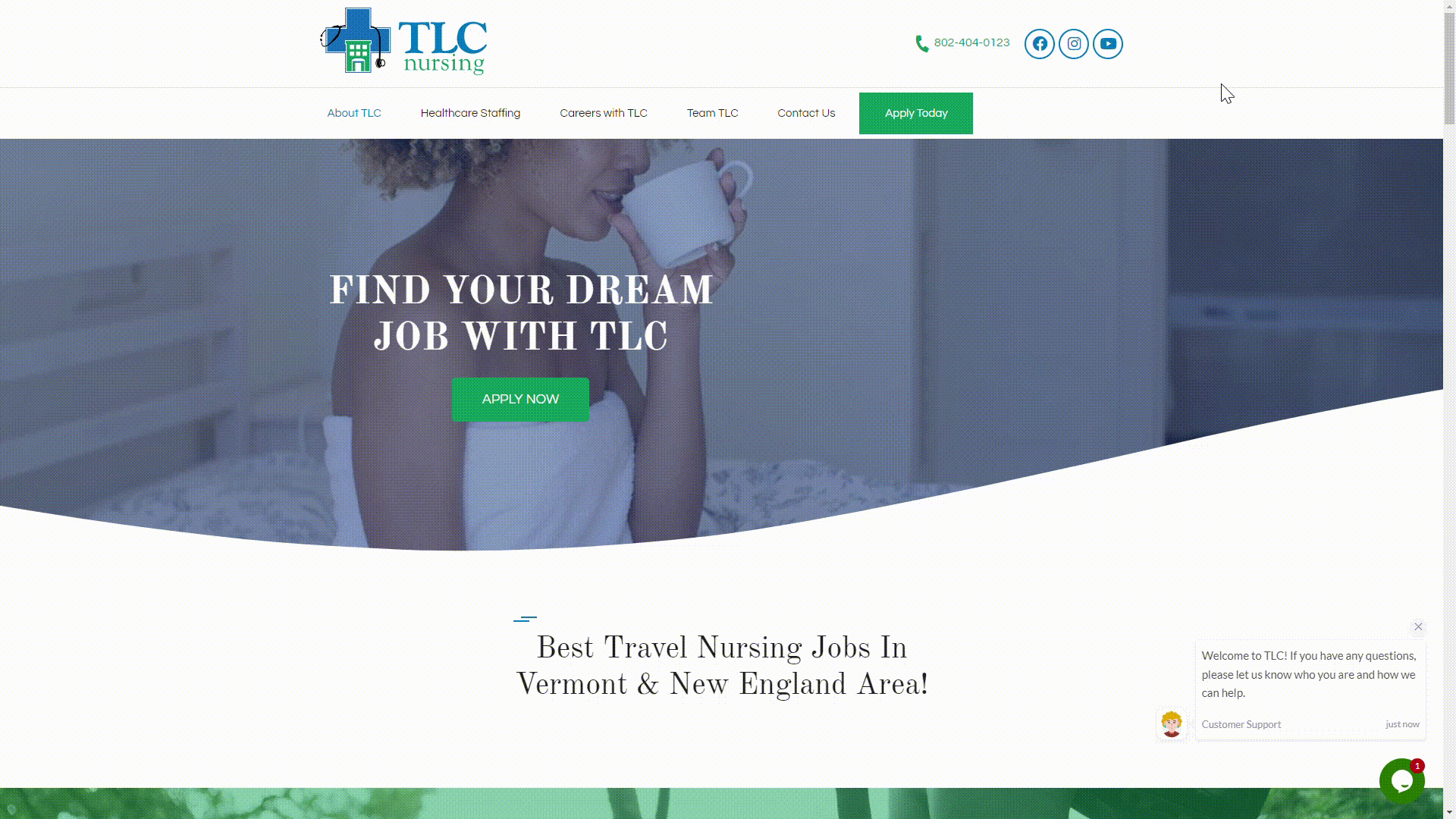
tlcnursing.com
- Through TLC’s hero section video, as well as the adventure-focused imagery throughout the site, viewers get the feeling that working with TLC will allow them a great sense of work-life balance—something that can be hard to come by in the healthcare field. Overall, TLC has a well-organized, user-friendly site, with a healthy balance of white space and graphics and a nice mix of serif and sans serif fonts. The time and effort they put into their overall design reflects their care for the people they serve.
Trusted Health
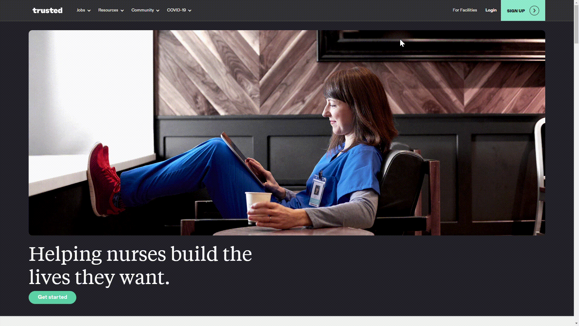
trustedhealth.com
- Opting for a dark colors and bright white text, Trusted’s hero section stands out. Continue down the home page and you’ll find a pleasant mix of serif and sans serif fonts, colorful icons, animated graphics and imagery, and ample white space. With easily navigable drop downs and concise copy, it’s easy for users to navigate this website and find exactly what they’re searching for.
Cross Country Nurses
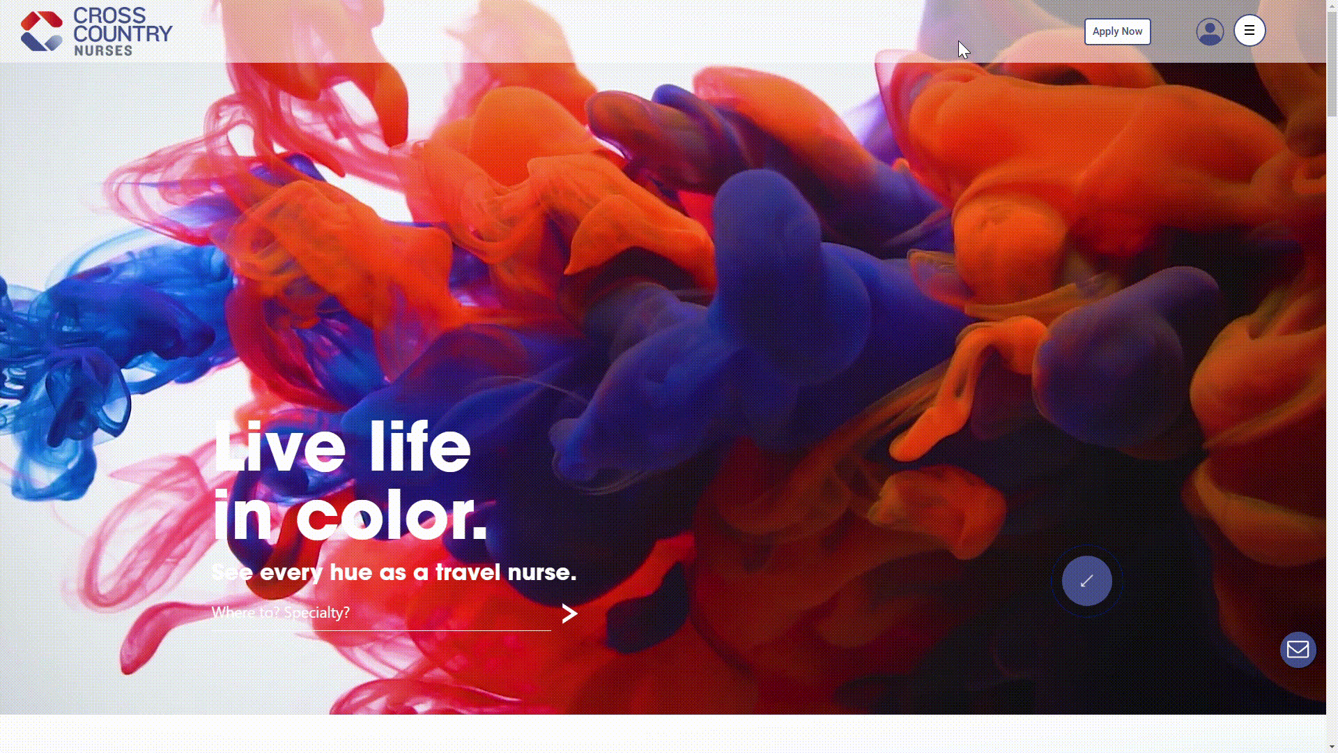
crosscountrynurses.com
- Right away, users are greeted by a vibrant video clip of colorful smoke blowing across the hero section of Cross Country Nurses’ homepage. Speaking to their brand’s encouragement to “live life in color,” as you scroll the site, you’ll find rich hues of turquoise, gold, and red. With simple and concise text throughout the site, the imagery and color choices really shine. These striking colors create the sense that you’re working with a forward-thinking, creative, and flexible brand.
Ardor Health Solutions

ardorhealth.com
- Based on their website, you can expect an exciting journey when working with Ardor. The homepage opens to a captivating image of a woman hiking, pairing well with their tagline. The outdoor activity theme is carried throughout the site, with images of people mountain biking, hiking, and kayaking, as well as images of healthcare professionals in front of mountainous backdrops. With no animations and concise text, this is another site where imagery stands out. These images are compelling to their travel nurse audience, one filled with people who want their next position to be an adventurous one.
Medical Solutions

medicalsolutions.com
- Medical Solutions puts a colorful, casual spin on their healthcare staffing website, leaning into their relationship-minded approach to business, as if their people are old friends looking out for your best interests. With hand lettering fonts and casual, occasionally humorous text throughout the site, it’s clear Medical Solutions puts people first.
Maxim Healthcare Staffing
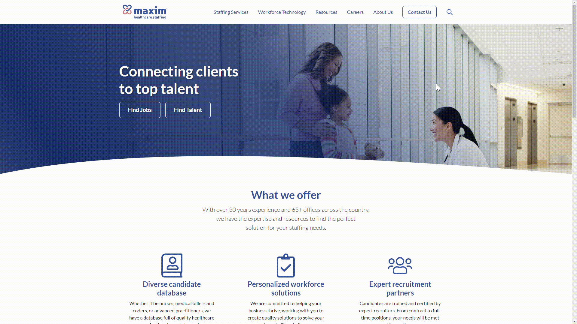
maximstaffing.com
- Maxim’s site is classic, clean, and concise without feeling sterile—sterile is great for patient rooms and ORs, but not so much for websites. Thanks to minimal imagery, great use of white space, and simple menu options, users will have no trouble navigating this site. Through their word choice, people-focused images, and embedded videos throughout the site, it’s clear Maxim cares deeply about the industry and people they serve.
Loyal Source
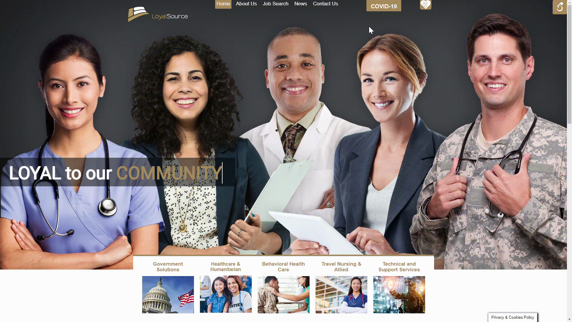
loyalsource.com
- Loyal Source’s website opens with a collage of professionals from each industry they serve. Not only based on the hero section animation spelling out who they’re loyal to, but also through all the imagery throughout the site, it’s clear Loyal Source is passionate about serving people. Not to mention, their use of simple menu options and text allows for easy navigation of their site, whether it’s a jobs page or a contact form.
Norwood
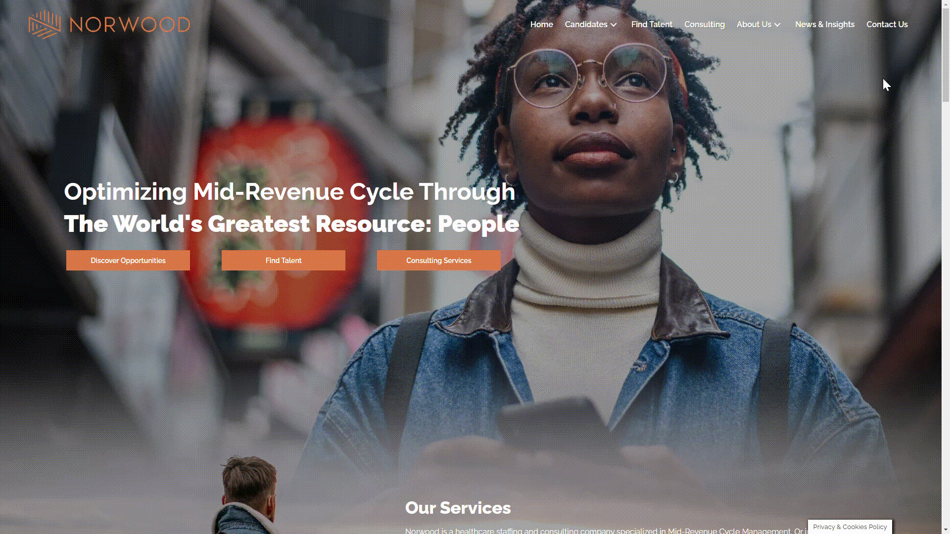
norwood.com
- Users are first dazzled by the high-quality, people-focused images and bright orange navigation buttons found on the homepage of Norwood’s website. The seamlessly blended images are paired with simple, white text that stands out—a style that can be hard to pull off against busy backgrounds. It’s clear Norwood is a brand that remains cool, calm, and collected in the face of the chaos that can accompany the healthcare industry.
Triage Staffing
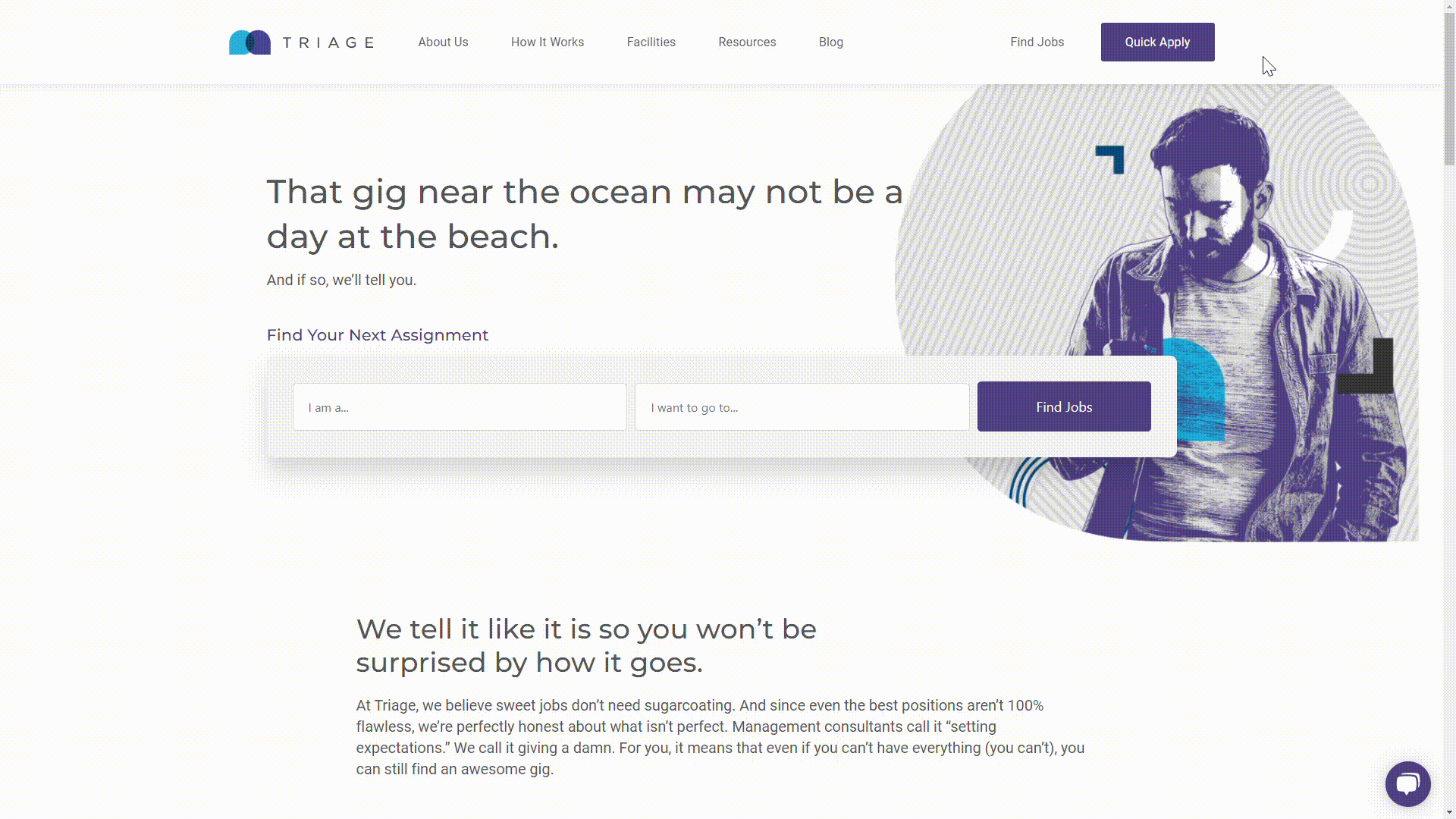
triagestaff.com
- With minimal imagery and animations, and ample white space, Triage highlights the messaging throughout their site, showcasing their unique and cheeky brand voice. While the design of the site is notable, with its modern theme and amusing graphics, the copy throughout this site is the most impressive aspect. It’s clear Triage is confident in their brand’s personality and understands their audience is professional but also has a sense of humor.
Staff Care
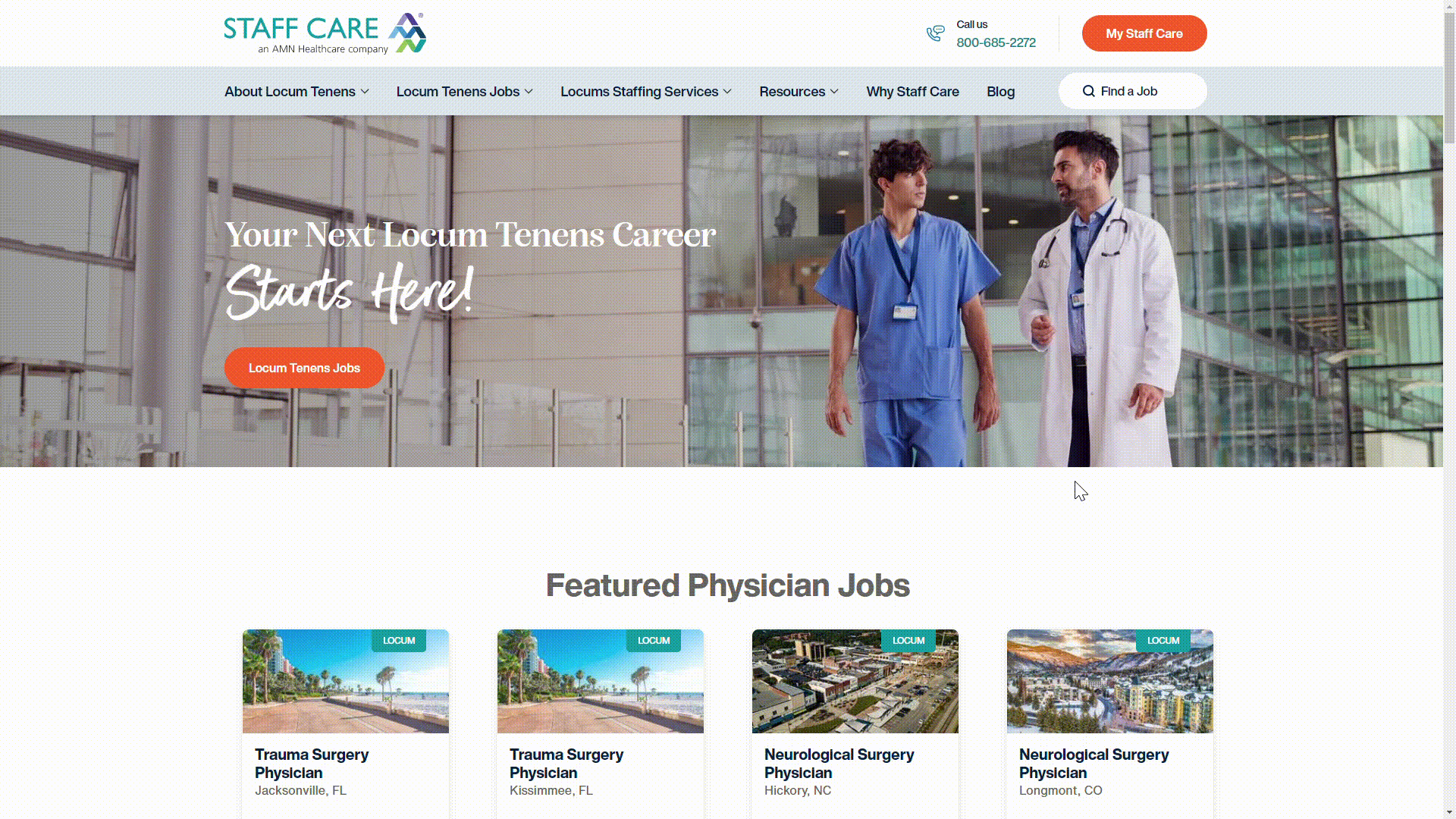
staffcare.com
- Abundant white space, a contemporary combination of serif and sans serif fonts, and timeless healthcare industry imagery make Staff Care’s website a success. Their website conveys a sense of professionalism and industry expertise. Whether you’re looking to hire healthcare professionals or searching for a new job, you’ll have no trouble finding what you’re looking for on this site.
All’s Well
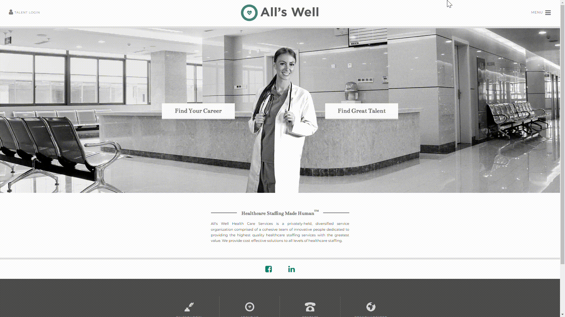
allswell.com
- All’s Well opts for a modest homepage, one that consists of only a header, a hero section, a short introductory blurb about their business, and a footer—and it works! Users are quickly separated into candidate or client categories, making it easy to find the information they need. The black, white, and green theme is carried throughout the site, allowing each page to blend effortlessly.
2nd Time Winners
Axis Medical Staffing
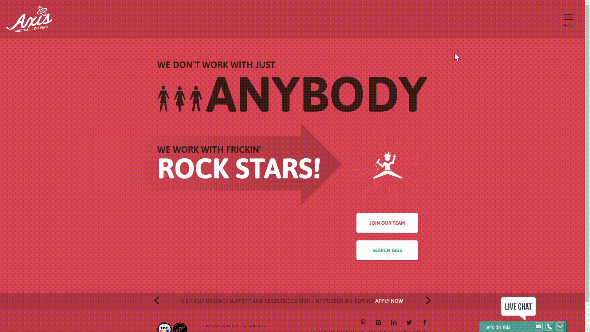
axismedicalstaffing.com
- Axis was one of our winners in 2019. While they haven’t made any major changes to their homepage, they continue to stand out with their bold choice of colors and messaging. The rockstar theme gives users a great sense of what it’s like to work with Axis, regardless of the audience reviewing their website.
Aya Healthcare
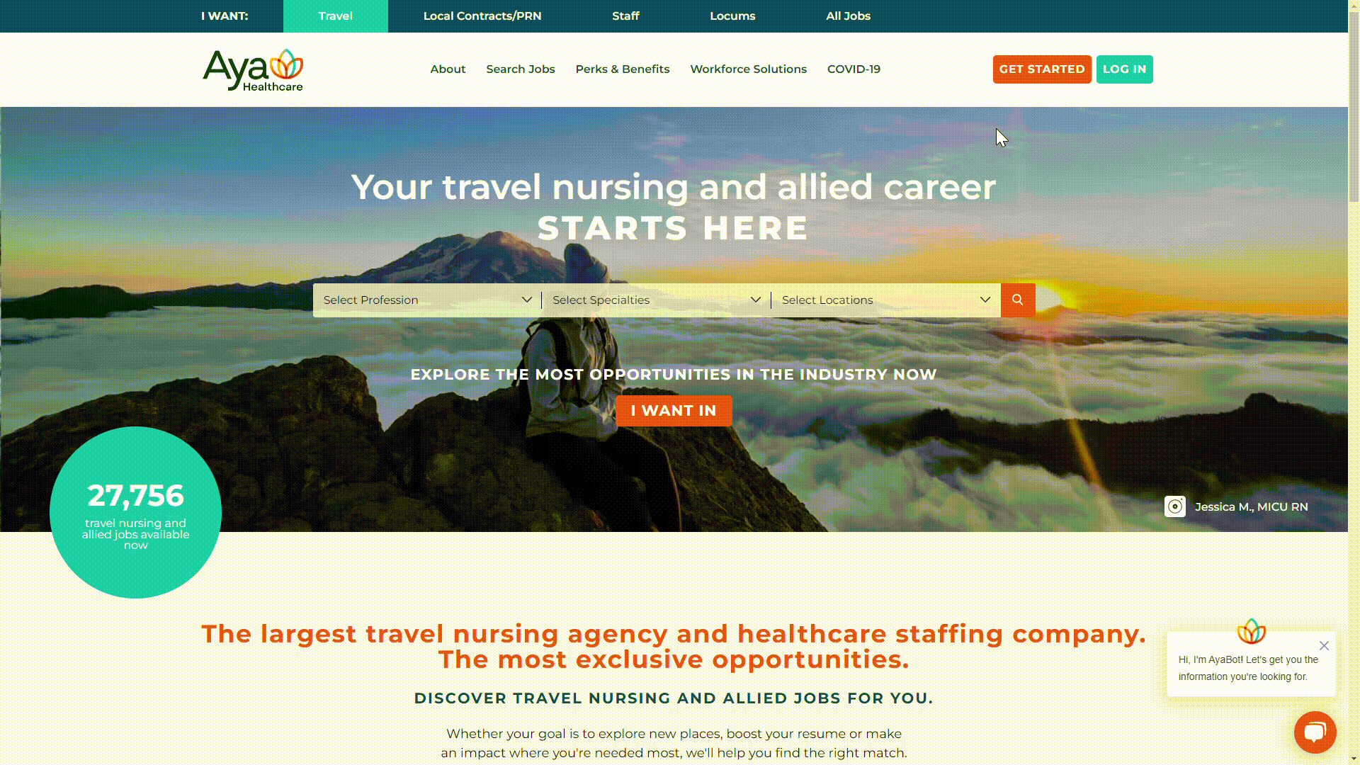
ayahealthcare.com
- Aya Healthcare, also a winner in 2019, has made impressive updates to their website. They still use a green, blue, and orange color scheme, but they’ve done away with the interactive U.S. map. They’ve opted instead for a simpler homepage design, with more copy and images related to their business. Most notable are all the photos of team members, clients, and candidates they work with; this choice adds warmth and a personal touch to the site, emphasizing their passion for their own team.
CHG Healthcare
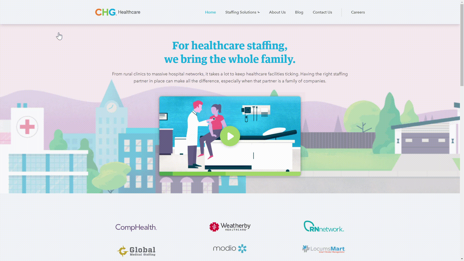
chghealthcare.com
- CHG has made some major site changes since we last awarded them in 2019. Their redesigned hero section includes a short video placed over an animated illustration. The video provides great insight into their brand, as well as how the healthcare industry benefits our society. As you click through the site, you’ll find detailed copy, balanced use of white space, high-quality imagery, and well-organized page sections. It’s clear CHG wants their audience to have a stress-free experience while navigating their site.
Emerald Health Services

emeraldhs.com
- Emerald has also made impressive updates since their last award in 2019. Their homepage now includes a video that bounces back-and-forth between footage of healthcare professionals in the workplace and enjoying life outside the clinic or hospital. This really encapsulates the best of both worlds they can offer candidates. Throughout the site, you’ll still find pops of bright emerald green, traveler-centered imagery, and thoughtful copy. These design choices are reflective of Emerald’s perfect balance of fun and professionalism.
TotalMed

totalmed.com
- Total Med, another 2019 winner, made some small changes that had a big impact on the feel of their homepage. One minor but strategic change was moving their social icons and contact information into the same header section as their logo and menu options. By bringing all this information into the same visual plane, it gives the header a more organized appearance. More obvious is their change in hero image, opting for an image of two people hugging that speaks to their passion for human relationships.
Congratulations to all our first and second-time winners! We hope these websites give you inspiration for your own staffing website.
If you’re in the market for a new website, but don’t know where to begin, reach out to echogravity today.
Let’s take your brand’s website to the next level