We Have the Winners! Announcing the Top Light Industrial Staffing Websites of 2022

The pandemic left a lingering impact on the light industrial industry. Across the country, distribution centers are feeling the negative effects of worker absenteeism, labor shortages, and reduced productivity. What can employers and staffing companies do to attract and retain warehouse workers? They need to infuse some creativity into developing a strong pipeline of candidates and go outside the box of traditional methods. Rebranding the industry as a place for long-term success and not just a temporary job people keep until something better comes along will be crucial for the success of light industrial staffing companies now and in the future.
A well-positioned, user-friendly website is pivotal to winning over jobseekers and gaining the trust of clients. At echogravity, we’ve been building websites since 2011, so we know a solid online presence in today’s technologically driven world is essential for reflecting your credibility as a light industrial staffing company and as a brand.
Our annual review of light industrial staffing websites serves to provide inspiration and recognize light industrial staffing and recruiting businesses for their efforts in innovative web design and informative messaging, while also allowing organizations the opportunity to self-assess their own websites.
We’ve analyzed hundreds of sites and chosen our top 20 using the following updated criteria:
- UI/UX — usability, accessibility, and responsive design
- Candidate experience — ample content catered to candidates and easy to use job board
- Innovative design techniques — think video, animation, illustrations, interactive elements
- Messaging — engaging, audience-centric content with minimal distraction
- Imagery that aligns with the brand and highlights services
- Font style — placement and appearance of headers, sub headers, page styling and formatting as a design element
Ready for a new site? Get started now
Atlas Staffing
Atlasstaffing.com
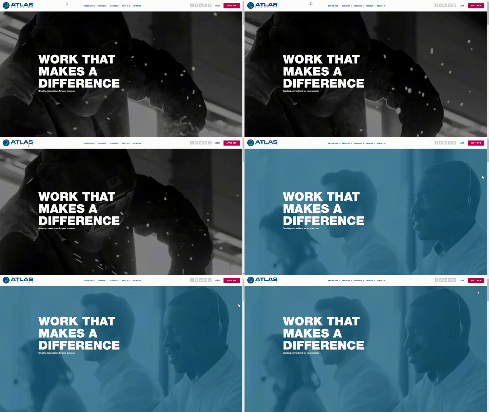
- One look at Atlas Staffing’s homepage and instantly you know you’re working with a high-caliber team. A simple video feed reflective of their main industries is paired with large, white lettering, allowing both the video and text to stand out individually. Throughout the site, you’ll find simple, clean imagery and concise copy; Atlas tells clients and candidates what they need to know without all the fluff. With thought-leadership content throughout their blog and a solid FAQ page for candidates, it’s clear Atlas is an organization of experts both light industrial companies and jobseekers can trust.
ABR Employment Services
abrjobs.com
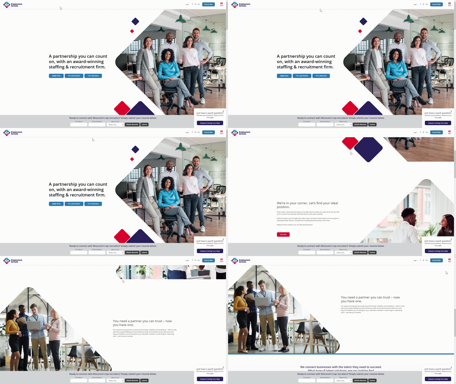
- ABR makes it easy for users to get to where they need to be. In their hero section, you have easy access to a resume submission button, jobseeker page, and business owner page, quickly directing viewers to the right place. ABR knows job searching takes time, so they have a footer that allows a user to instantly submit a resume—just enter your name, email, and location and you’re done! With touches like these, as well as simple menu options, succinct copy, and both an employer and jobseeker FAQ page, ABR shows clients and candidates they value them and their time.
Ethan Allen Workforce Solutions
eaworkforce.com
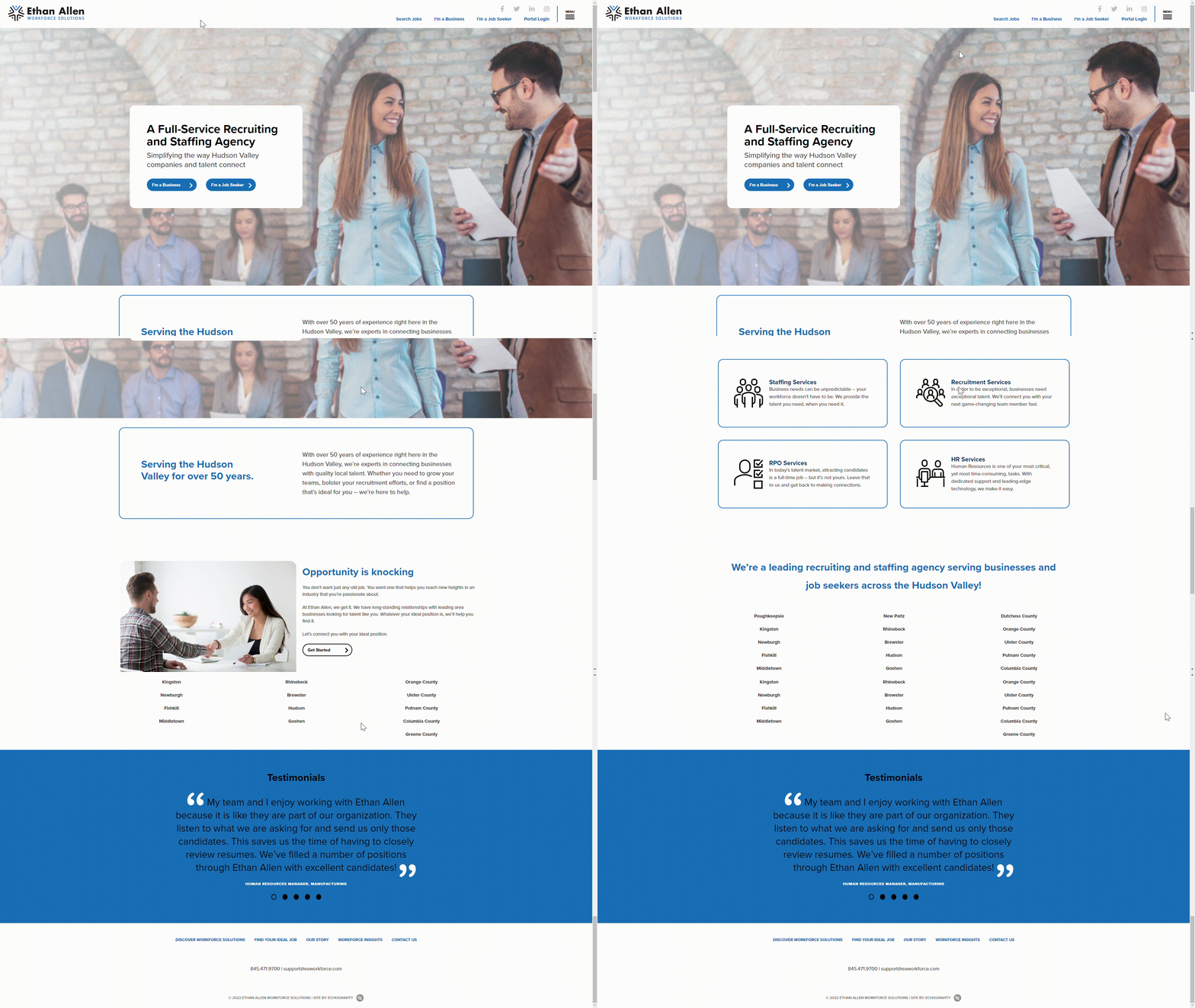
- Clean, classic, and professional are a few words that come to mind when browsing Ethan Allen’s website. With a simplistic design and minimal imagery, users have no choice but to engage with the copy—which is a good thing, the writing is authentic and intentional. It’s clear Ethan Allen is excited to introduce themselves to their viewers, and they do an excellent job of welcoming their audience to their brand.
Placers
myplacers.com
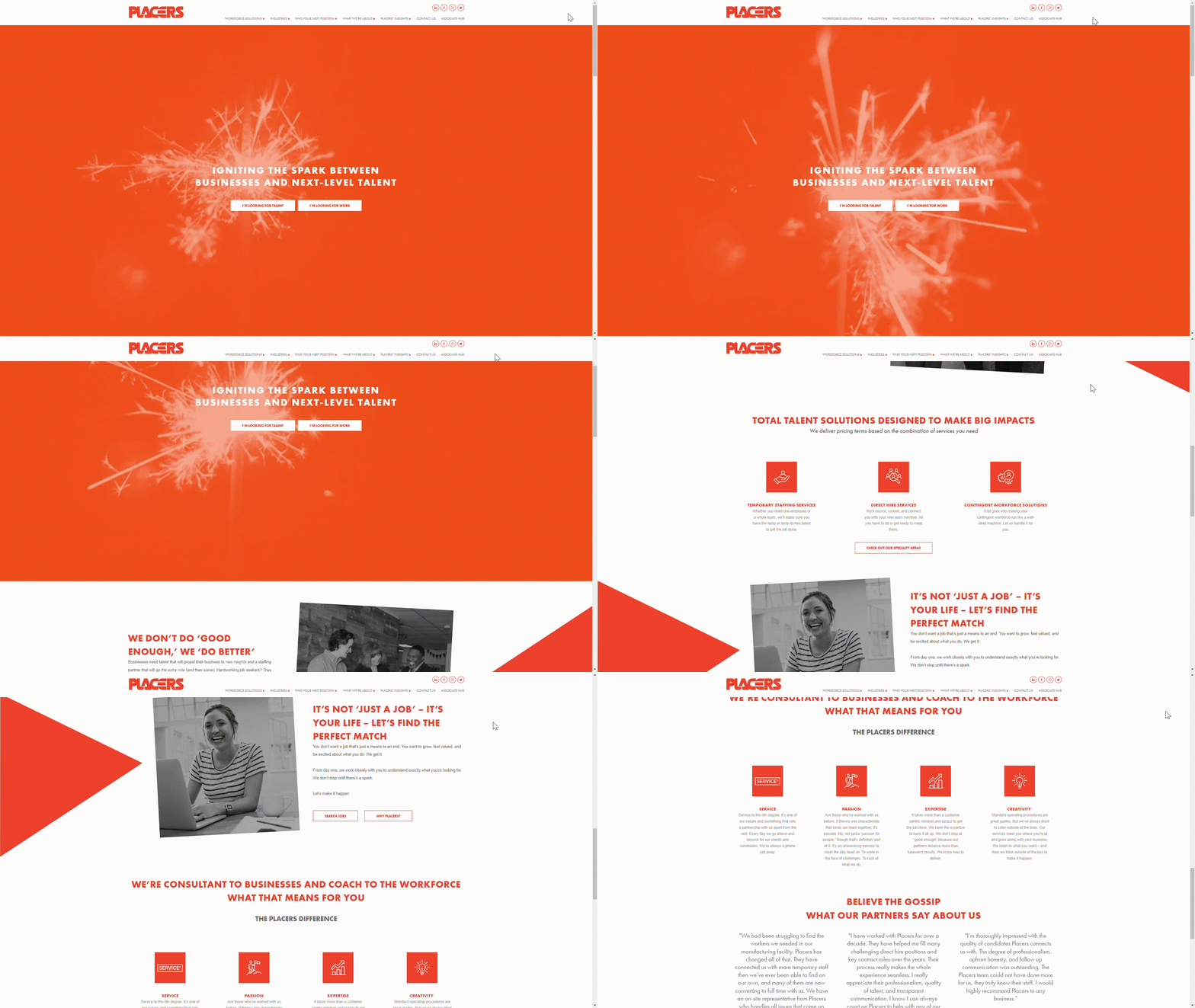
- Placers’ site is one that makes job searching in the light industrial industry fun, which makes attracting candidates that much easier. The lively orange color scheme paired with black and white images makes each component pop. The lettering style and font throughout the site is clear-cut, with no shadowing under the text and clean lines surrounding the buttons; the softness of the font helps balance out the loudness of their brightly colored theme. If anyone is succeeding to make the light industrial industry look attractive to potential candidates, it’s Placers.
Available Staffing Network
availablestaffingnetwork.com
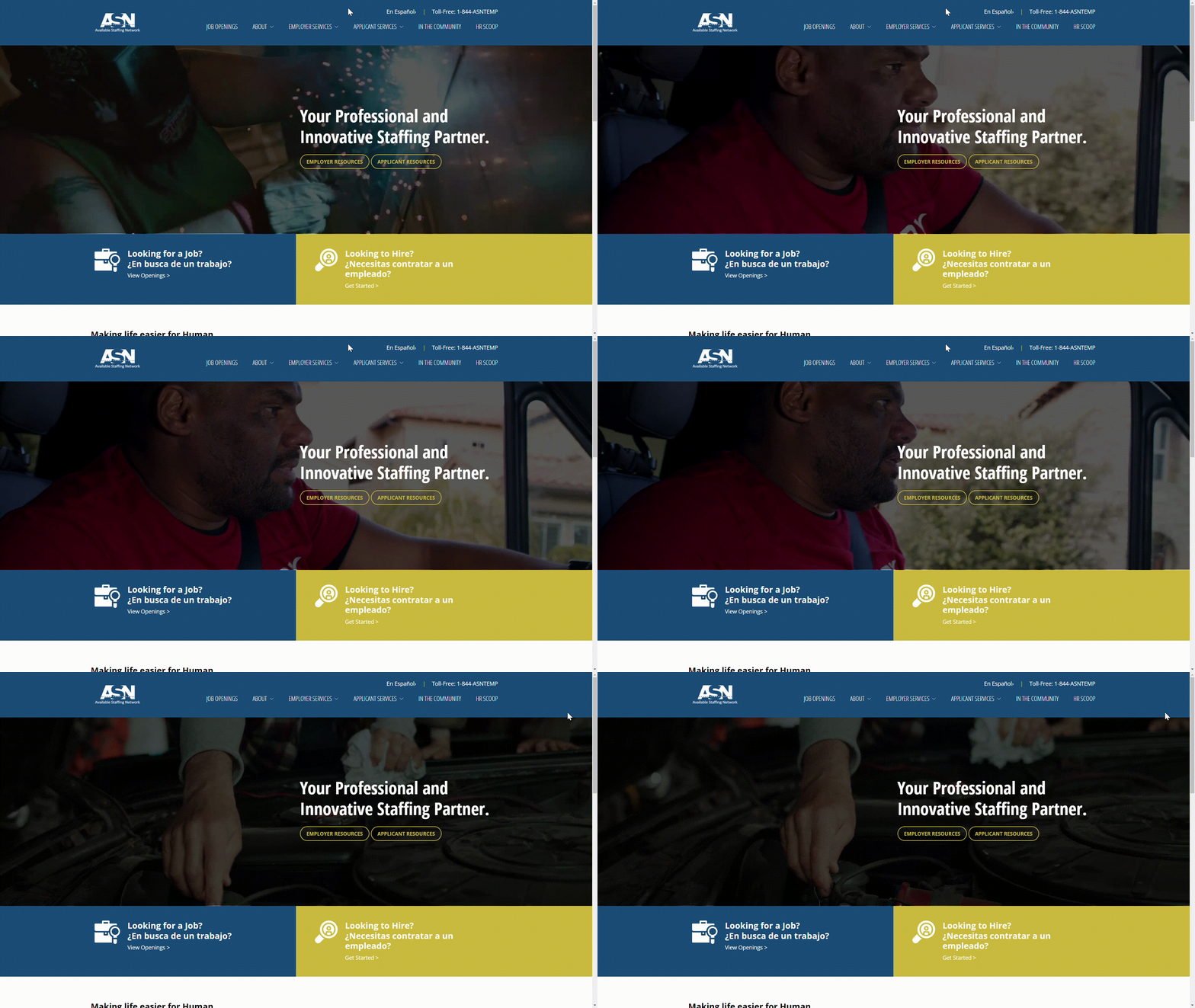
- Sharp videography and clean text invite you into ASN’s homepage, evoking the type of workplace where candidates can expect to grow their careers. Besides their quality copy and modern site theme that showcases their expertise, most notable is the ability to translate important candidate information into Spanish with one click. ASN’s site clearly reflects their dedication to their clients’ and candidates’ experience.
FlagShip Staffing Services
flagshipinc.com
- FlagShip’s website opens to a video reel of people working in different industries they serve, reflecting their innovative spirit and people-first branding. As you browse the site, you’ll find colorful and interactive graphics, informative messaging—even an option to view job listings in Spanish—and plenty of testimonials. They also have a unique “Socials” menu option, which pulls all their most recent social posts across platforms onto a single page, making it easy for clients and candidates to see what the company is all about. Through FlagShip’s site design and messaging, their company values shine, allowing users to visualize what it would be like to work with them.
HTI Employment Solutions
htijobs.com
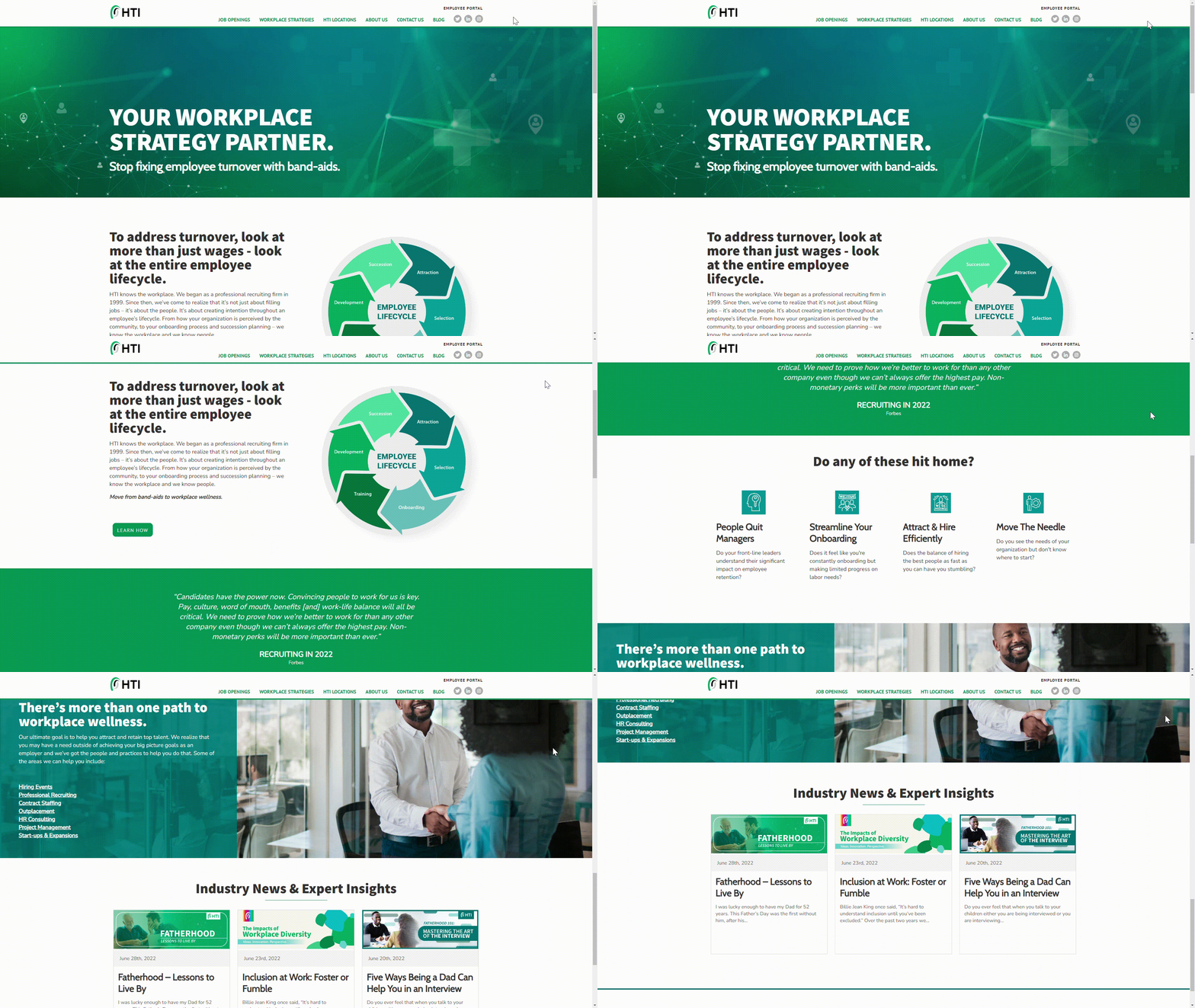
- HTi’s green color scheme effectively ties in with their theme of “workplace wellness,” giving users a sense of calm and trust. Their commitment to an excellent candidate, client, and employee experience shines through their website, from imagery to recent blog post topics. Putting their industry knowledge and experience on display, they’re not afraid to give their honest opinions about the state of today’s workforce and what it takes to be successful when hiring. Overall, HTI’s site makes hiring and job searching simple and informative.
John Galt Staffing
j-galt.com
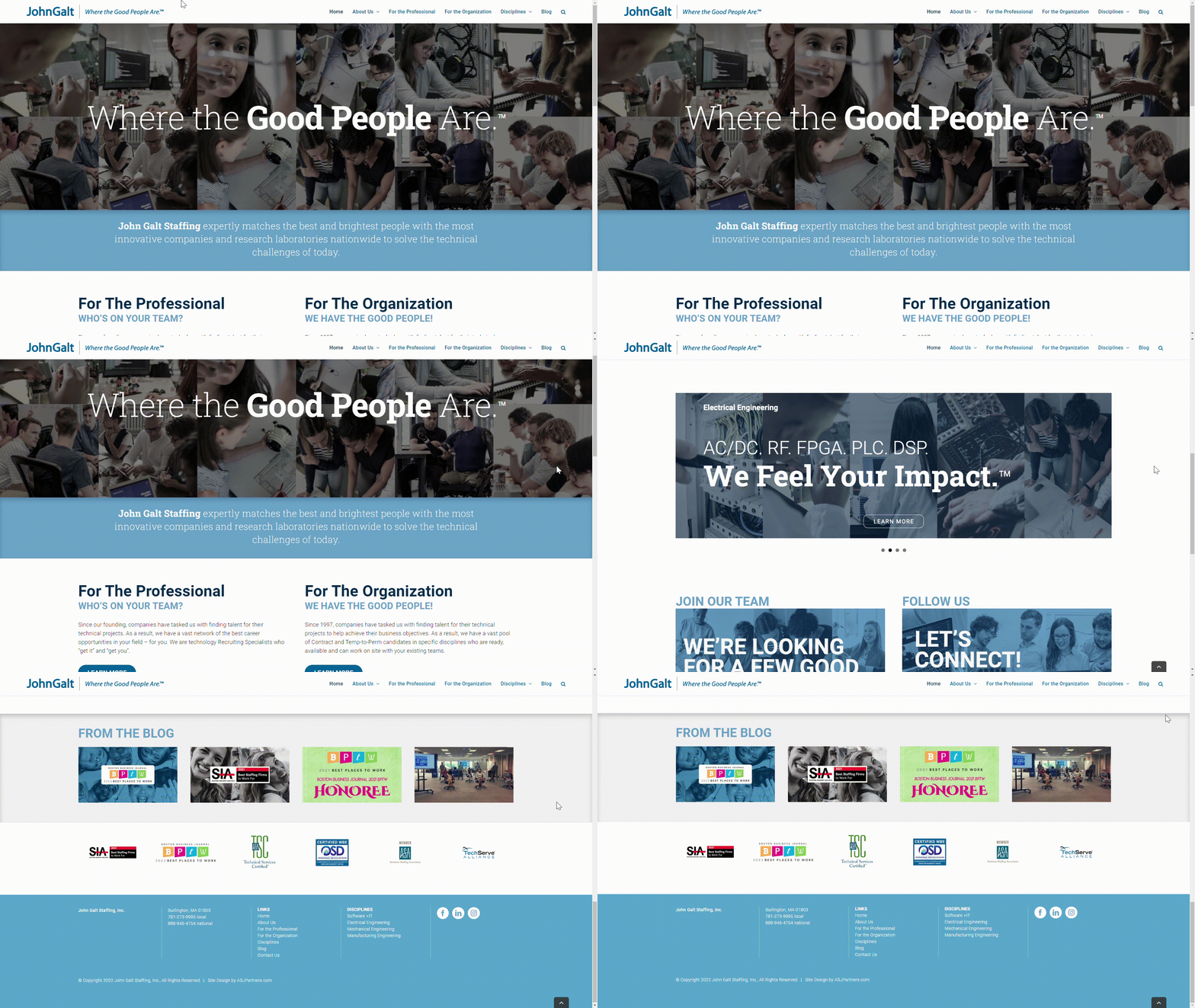
- John Galt Staffing’s people-focused approach is reflected not only in their tagline, but also in the imagery and quality copy throughout the site. Using words like team, personal, relationships, and you-focused messaging gives both clients and candidate a sense of trust. A combination of ample white space and simple menu options makes it easy for users to navigate their website. With plenty of awards to show for it, John Galt Staffing really is a team of good people.
NewVine Employment Group
newvinegroup.com
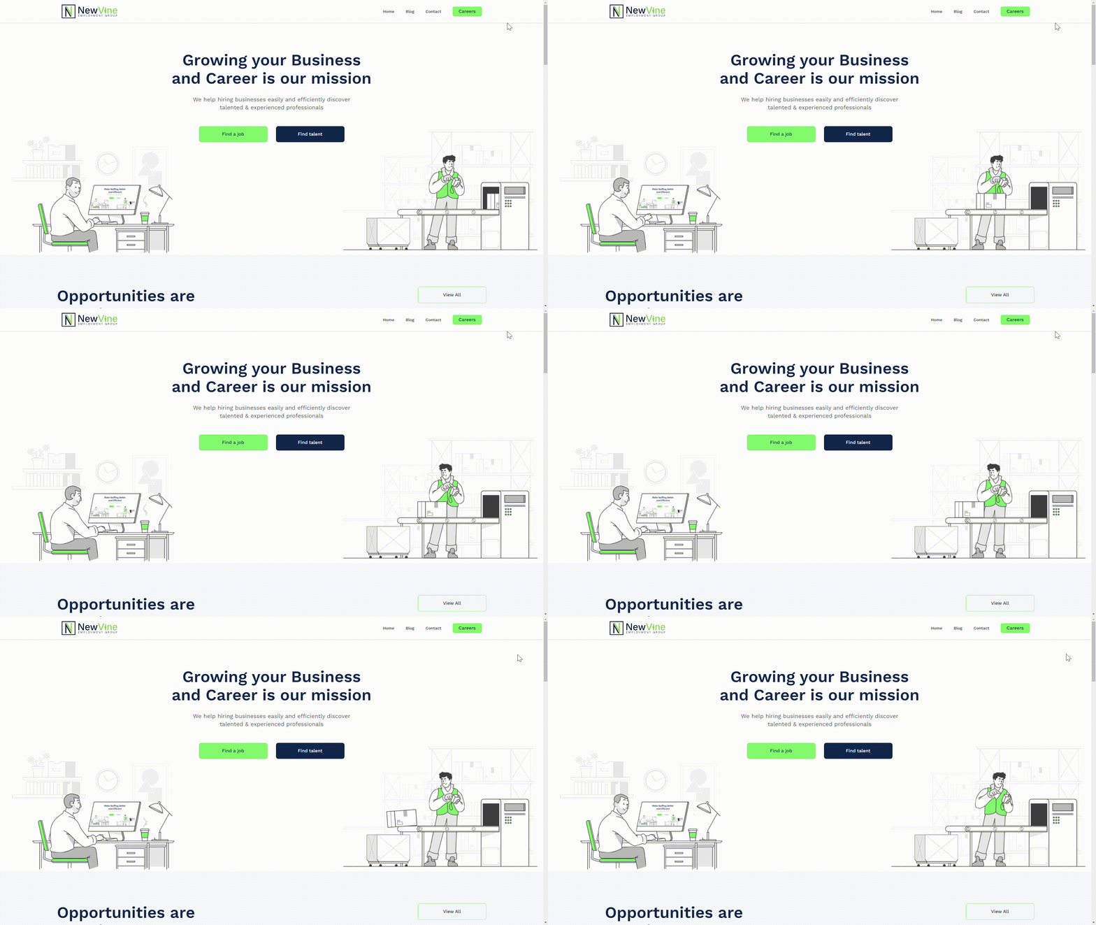
- NewVine makes light industrial work look fun. An incredibly simple home page is effectively paired with cheeky, animated graphics throughout, holding users’ attention as they scroll the page without being overwhelming. Streamlining the hiring and job search process even more, clicking the contact button in the header (which is one of only three options) automatically opens a user’s email application. Most notable is the beautiful career page, where you’ll find a video reel and collection of photos of the NewVine team at work. Their website clearly displays their passion for the people they serve, reinforcing the fact that candidate and client growth is their forte.
PeopleReady Inc.
peopleready.com
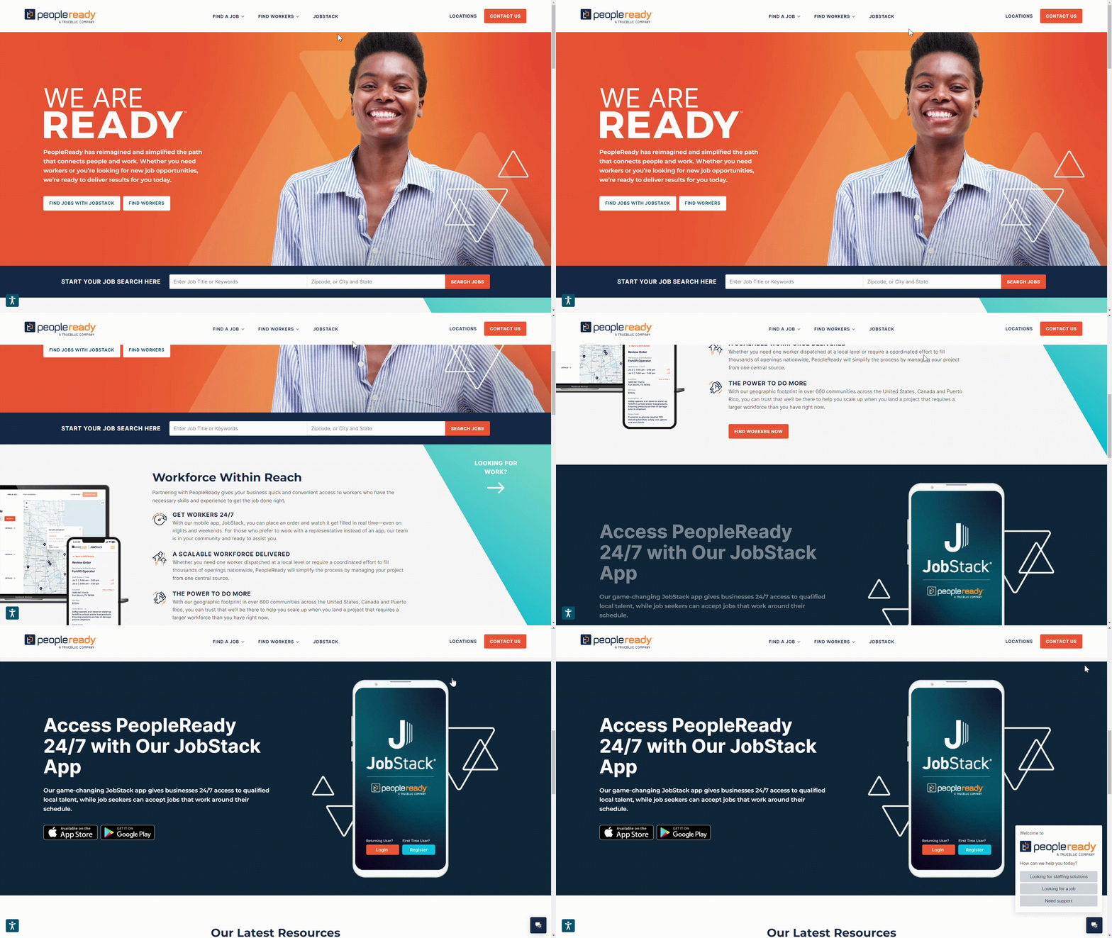
- A contrast of vibrant orange and deep navy blue greets you as you open PeopleReady’s website, immediately grabbing candidates’ attention and keeping them from bouncing elsewhere. Another site that only has three options in their header, PeopleReady makes it easy for the different members of their audience to find the information designed for them. From their associate resources page to their blog posts separated by candidate and client audiences, PeopleReady’s website shows they know how to connect with each of their audiences.
QPS Employment Group
qpsemployment.com
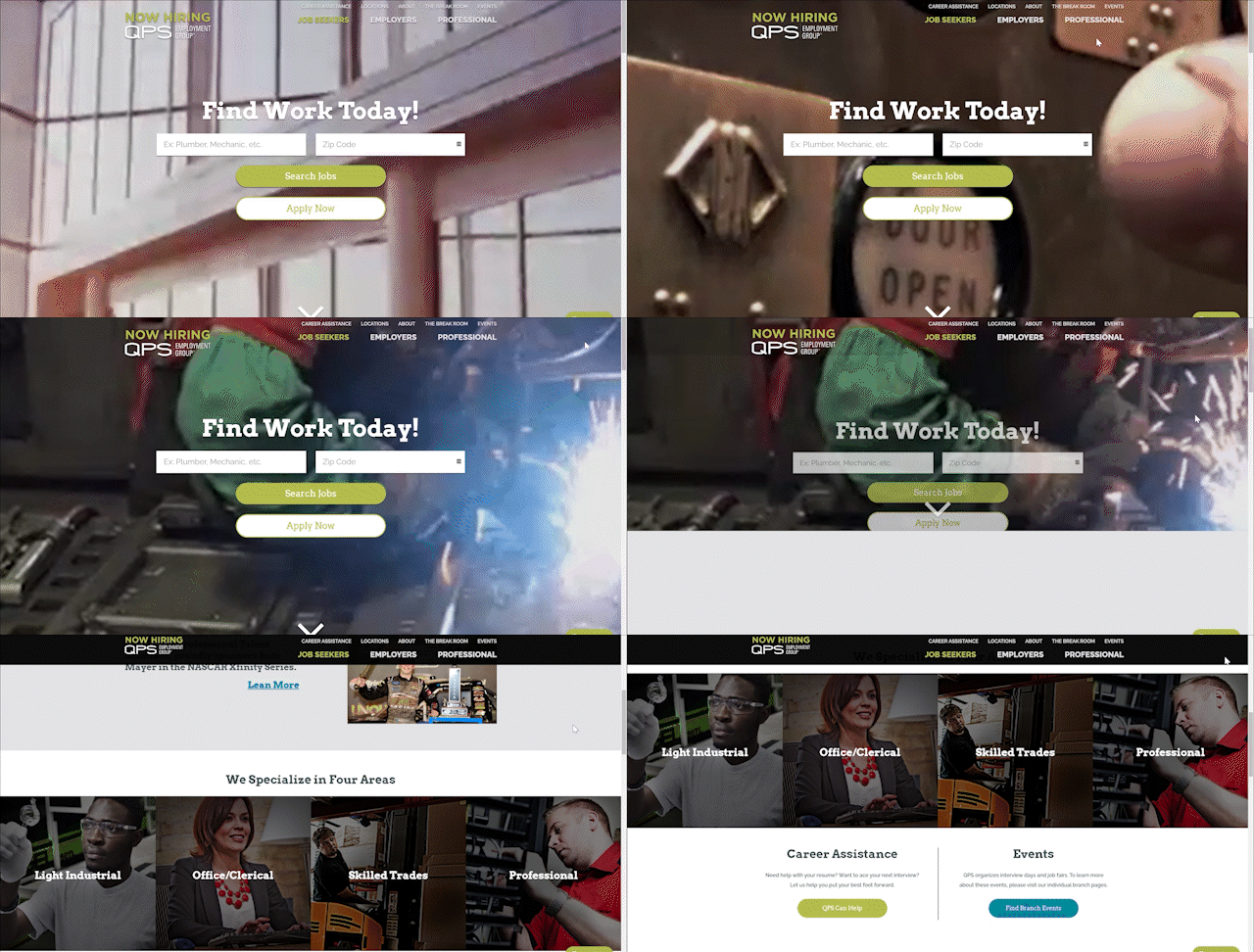
- With video feed of light industrial employees at work and people-focused imagery, QPS lets users know their people are top of mind. Their menu options are well organized and easily navigable, allowing users to find the information they need quickly. Our favorite part of the site is their blog, The Break Room, which is separated by client and candidate audiences—no need to dig though tons of posts for something relevant to you. Additionally, ample FAQ pages and the option to translate information into Spanish reinforces QPS’s passion for people and going the extra mile to connect with them.
Rotator Staffing
rotator-staffing.com
- Rotator Staffing organizes their submenus within their header menu pages, making a large amount of copy effortlessly consumable. With a healthy amount of white space and minimal imagery throughout the site, their informative messaging is put on display. Through a stress-free navigation experience and service-oriented copy, Rotator Staffing is an experienced company that strives to serve those they work with.
Snelling Staffing
snelling.com
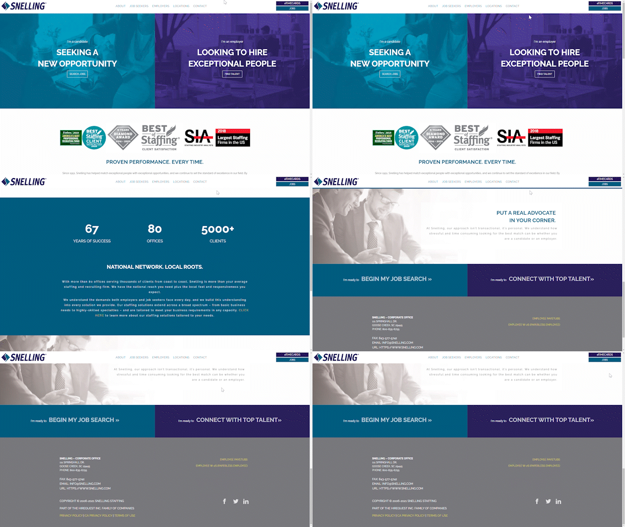
- If the awards on their homepage weren’t enough to convince you of their expertise, Snelling Staffing includes an animated graphic that counts their years of success, number of offices, and number of clients served. With just two menu options, web visitors are quickly directed where they need to be. Including a simple job portal and enlightening information on their client page, Snelling makes it clear they exist to advocate for their clients and candidates alike.
The Job Center
thejobcenterstaffing.com
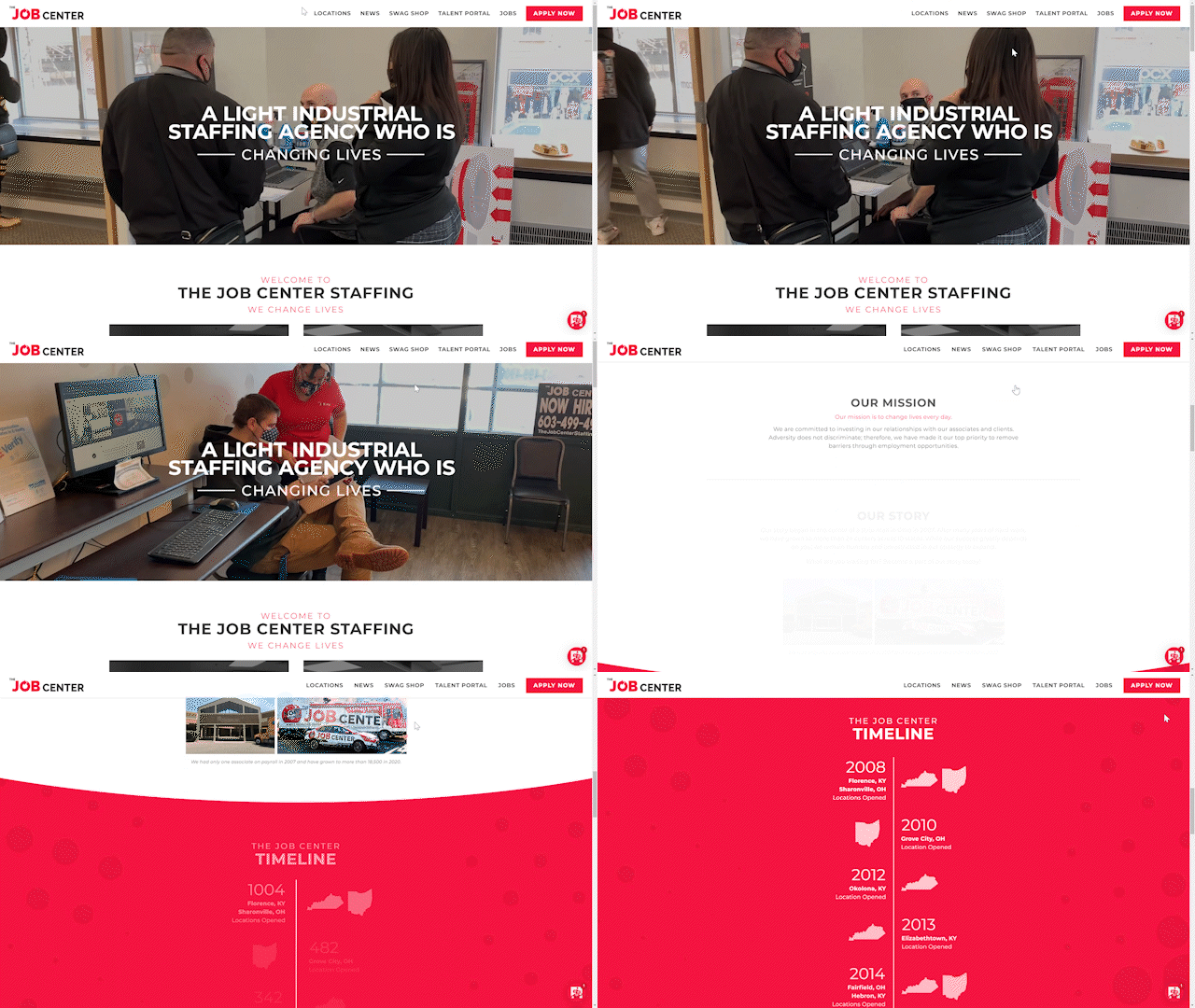
- Now this is an engaging light industrial website. You can tell The Job Center is passionate about highlighting what they do and who they serve in an engaging way. Just take some time to look at the videos showcasing their employees and candidates, the interactive and intuitive menu options, and an animated timeline of their company history . It’s easy to be proud of your work when you put your heart into it, and The Job Center’s website is a testament to their excitement for staffing and recruiting.
Total Staffing Solutions
totalstaffsolutions.com
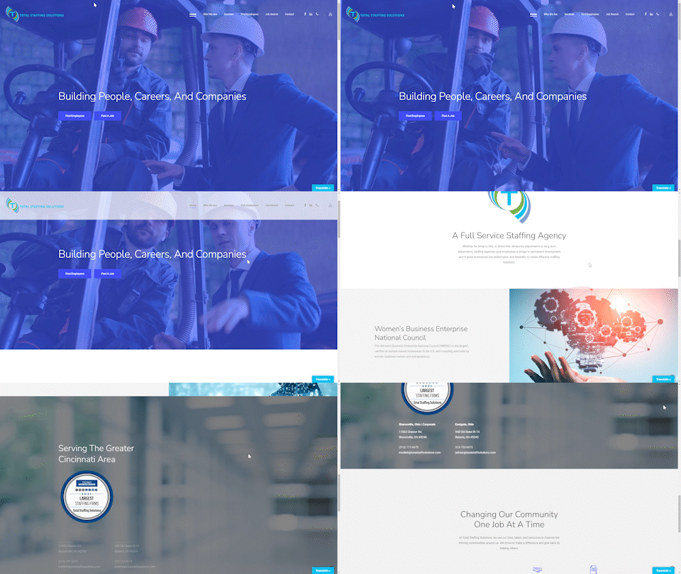
- Fresh, clean, and modern are a few words that sum up the Total Staffing Solutions website. The high-quality video in the hero section of their homepage shows an executive chatting with a warehouse employee, emphasizing their goal to create quality partnerships between the C-Suite and the shop floor. With simple graphics, structured messaging, and classic light-industrial imagery, Total Staffing Solutions’ experience is well reflected throughout their site.
Xpand Staffing
xpandstaffing.com
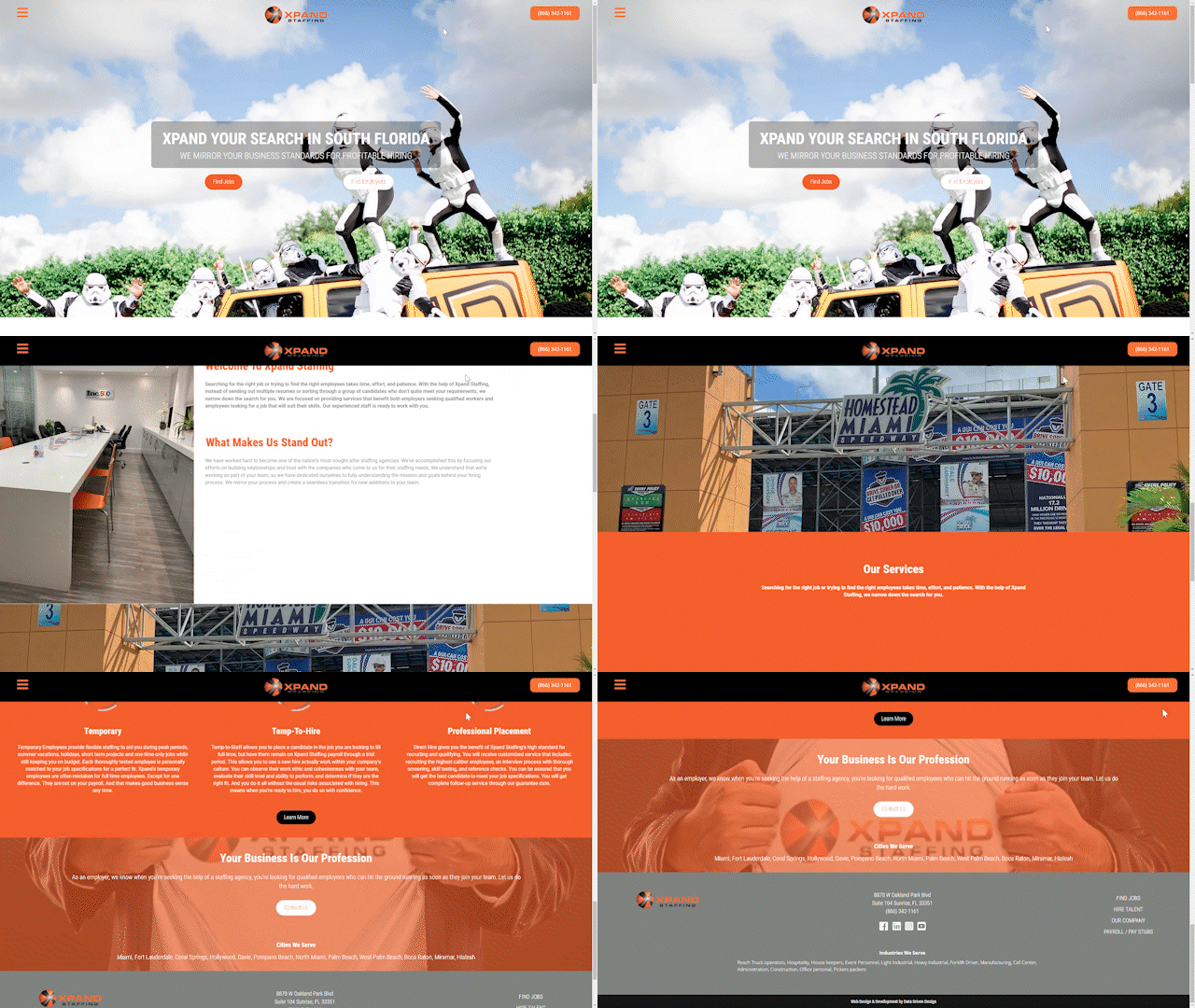
- Talk about a website with personality! Xpand Staffing’s website opens to a photo of their staff members wearing Stormtrooper costumes posed with a bright orange Xpand Staffing Jeep. Interactive graphics and text pop out at you as you scroll down the page, reflective of this brand’s big personality. With a comparatively small amount of copy, images, and menu options, Xpand still successfully shows users who they are as a company: down to earth and knowledgeable about how to stand out.
Carlton Staffing
carltonstaffing.com
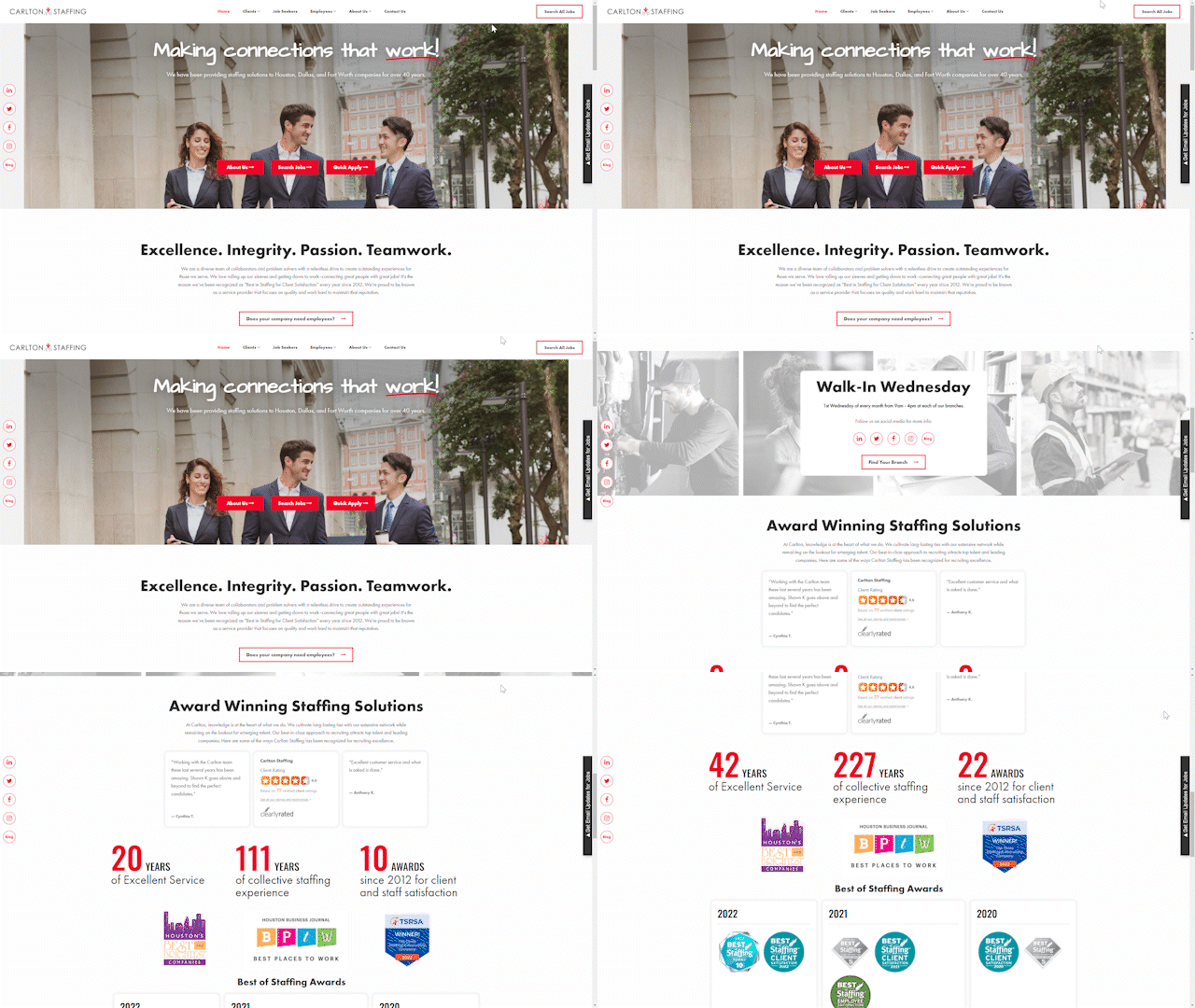
- Carlton Staffing’s use of images that include professionals in suits and ties collaborating with each other serves to brand light industrial work as a legitimate opportunity for long term career success. They commendably balance classic sans serif font with a handwriting-esque font, giving a sense that they add a more personal touch to everything they do. Overall, Carlton Staffing’s website is an excellent display of their united and professional company.
Staffing Alternatives
saworks.com
Staffing Alternatives makes a generous serving of information digestible with concise copy and well-organized menus. Strategic use of a people-focused photo reel at the top of their home page beautifully ties in their brand colors of orange and dark blue. These creative pieces come together with bold typography and straightforward navigation to create a contemporary, entertaining user experience users can expect is reflective of their culture and processes as a company.
Terra Staffing Group
terrastaffinggroup.com
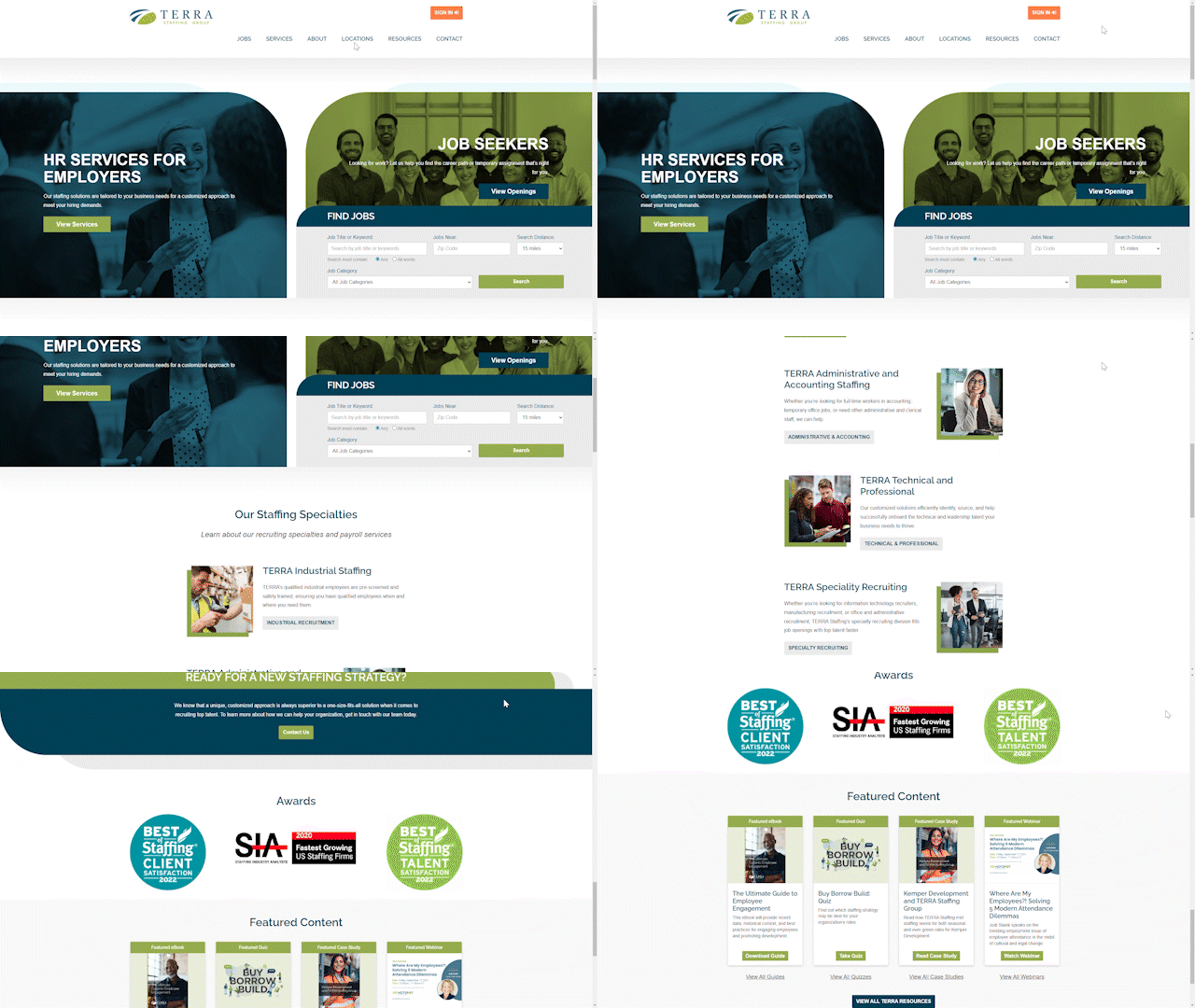
When your industry experience speaks for itself, sometimes a simpler website is best for your brand. Terra Staffing Group uses simplistic, interactive buttons and clear, succinct messaging that evokes feelings of honesty and humility (which many candidates appreciate about their recruiters if you look at their Best of Staffing Talent Award). A lack of images allows users to easily navigate the site with minimal distractions—this design choice makes it clear that the you-centered language throughout the site is most important.
Factory Fix
factoryfix.com
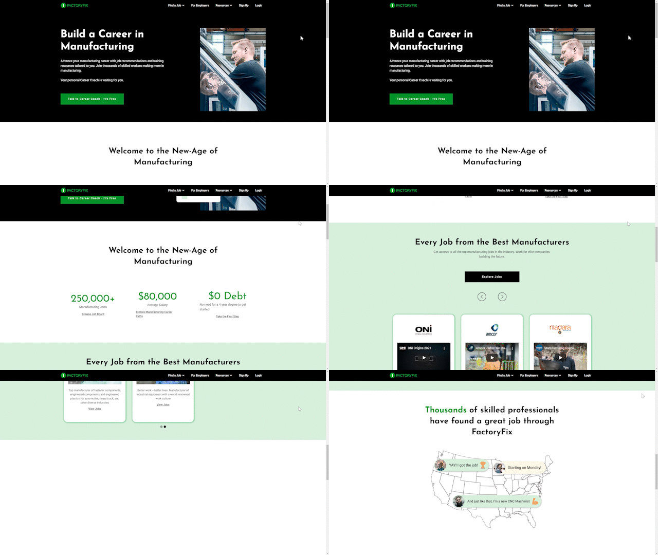
Factory Fix includes an eye-catching, unique animation in their hero section, depicting the hiring process for a candidate. As you scroll the site, you’ll find tons of interactive menu options and people-centric photos. With plenty of testimonials to show for it, Factory Fix is a company focused on strong business solutions and harnessing the power of people.
Congratulations to all our winners! We hope these websites give you inspiration for your own staffing website.
Need a website rebrand, but don’t know where to start? Reach out to echogravity. Our team will help you attract and retain top light industrial candidates and earn the trust of clients.
Let’s take your brand’s website to the next level
