
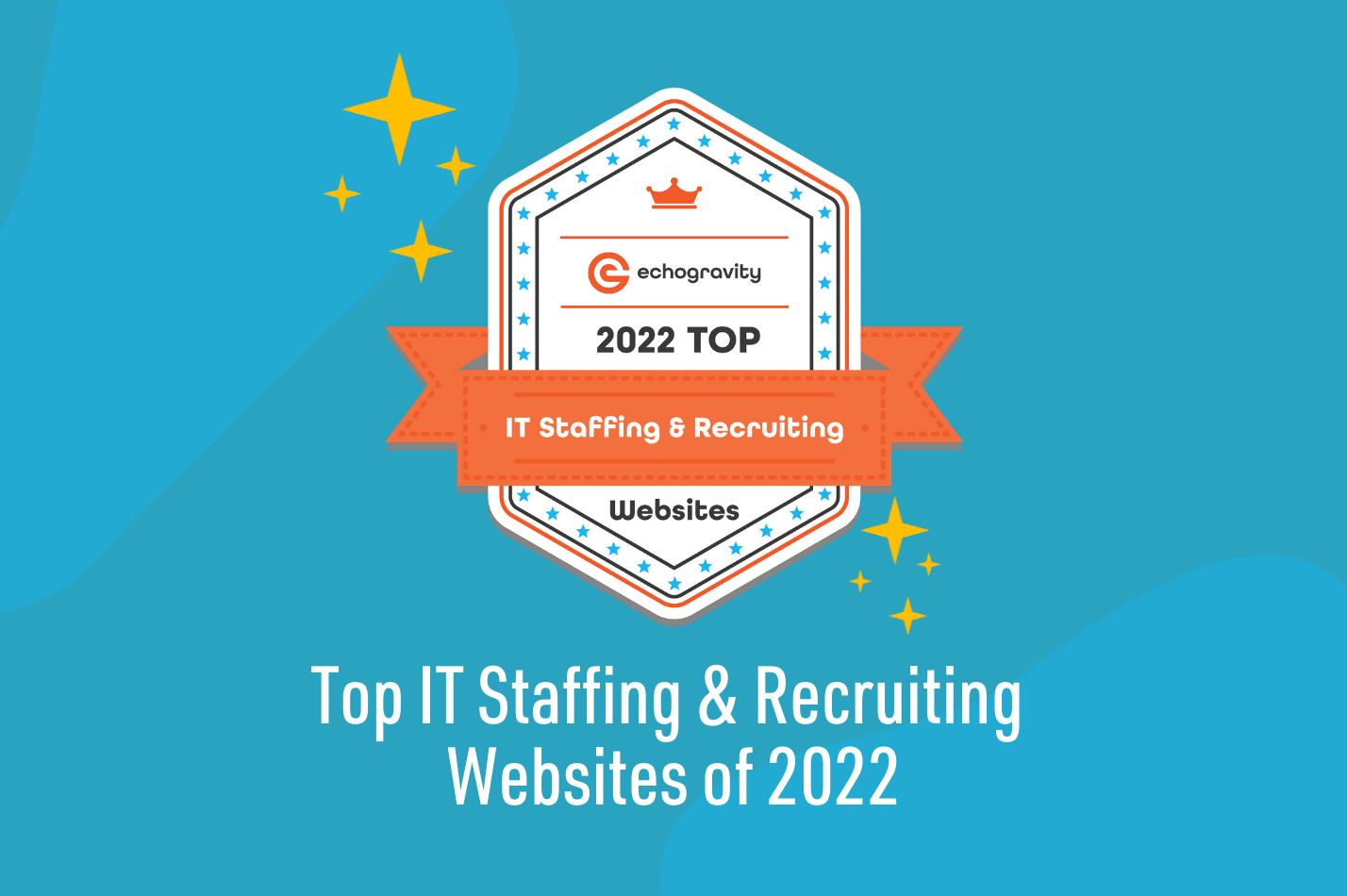
Introducing the Top IT Staffing Websites of 2022
At echogravity, we’ve been building websites since 2011, so we know a solid online presence in today’s technologically driven world is essential for reflecting your credibility as a company and as a brand. Especially in the staffing and recruiting world, where pre-pandemic there were 25,000 staffing and recruiting firms in the U.S. operating around 49,000 offices, it can be a challenge to stand out and show distinction in the marketplace. In this competitive IT job market, a well-positioned website with clarity is pivotal to winning over jobseekers and gaining the trust of clients.
Our annual review of IT staffing websites serves to provide inspiration and recognize IT staffing and recruiting companies for their efforts in innovative web design and informative messaging, while also allowing businesses the opportunity to self-asses their own websites. This year, we’ve divided winners into two sections: new winners and 2nd annual winners who also won in 2021 and continue to impress us. See a full list of our 2021 winners here.
We’ve analyzed hundreds of sites and chosen our top 20 using the following updated criteria:
- UI/UX — usability, accessibility, and responsive design
- Candidate experience — ample content catered to candidates and easy to use job board
- Innovative design techniques — think video, animation, illustrations, interactive elements
- Messaging — engaging, audience-centric content with minimal distraction
- Imagery that aligns with the brand and highlights services
- Font style — placement and appearance of headers, sub headers, page styling and formatting as a design element
Ready for a new site? Get started now!
New Winners in 2022
Abacus Technical Services
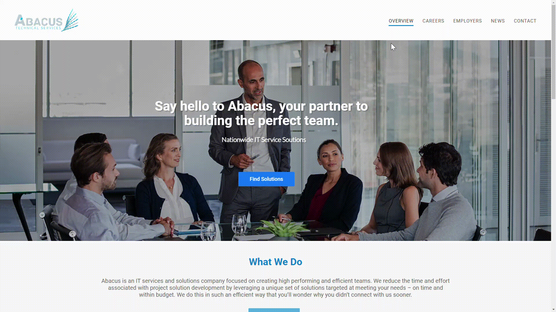
abacustechnical.com
-
- Abacus Technical’s website is proof that sometimes less is more. Their messaging is concise and organized, and they chose not to include any sub menus. The simplicity of their website allows users to quickly find exactly what they’re searching for.
Big Wave Staffing
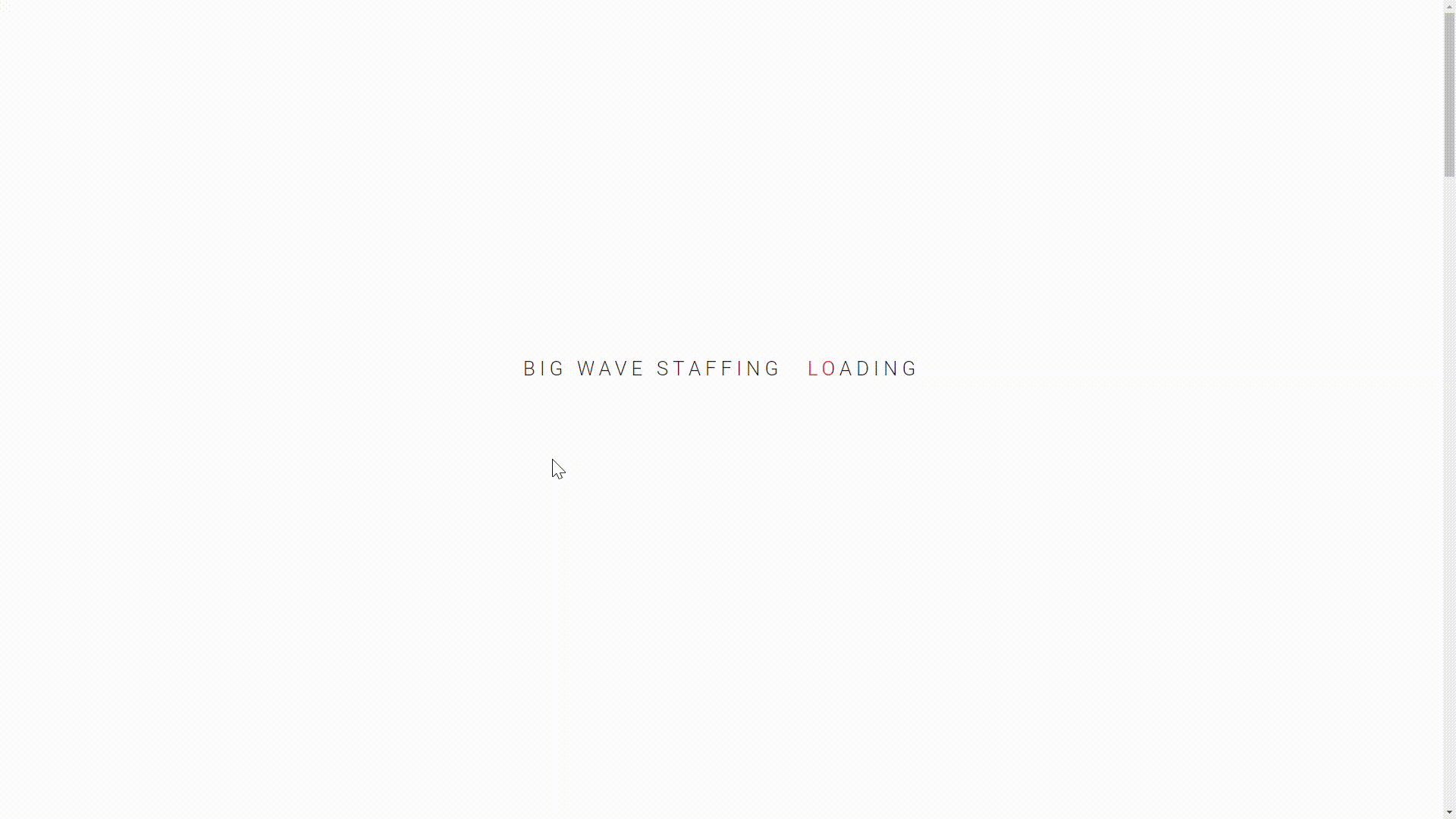
bigwavestaffing.com
-
- With sharp videography and imagery and well-organized text and an interactive homepage theme, Big Wave Staffing makes a simple website design stand out. Also opting to forgo sub menus, their website points directs users to where they need to be without all the fluff.
Insight Global
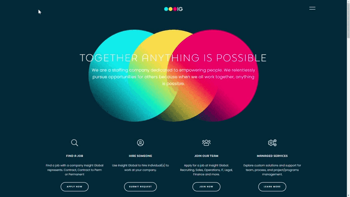
insightglobal.com
-
- Viewers are immediately captured by the bright colors of Insight Global’s home page, with deep blues, bright whites, colorful circles, and people-focused photography continuing as you scroll through the site. Clean, bright lettering is used effectively against dark backdrops across the site as they describe their company culture, reflecting their brand’s uniqueness and passion for people.
BridgeView
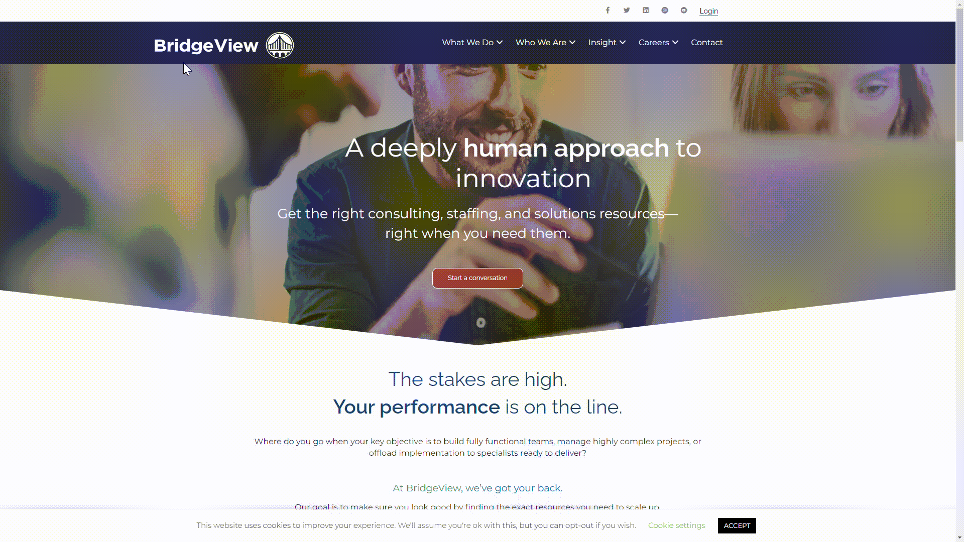
bridgeviewit.com
-
- Classic, professional, and trustworthy are just a few of the words that come to mind when browsing BridgeView’s website. Their experience in the staffing industry is well conveyed through the perfect balance of text, white space, interactive and colorful graphics, and crisp photography throughout their site for growth.
KORE1
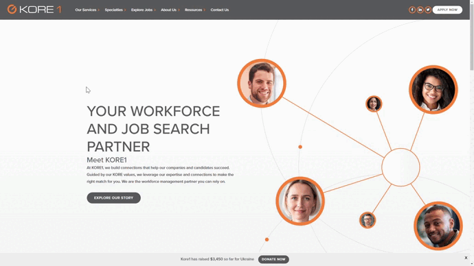
kore1.com
-
- Clean text is paired with simple, people-oriented graphics throughout KORE1’s website, emphasizing their messaging. With an active donation counter at the bottom of the screen, photos of their team, and messaging that references their core values, viewers automatically know that KORE1 is committed to employees, candidates, clients, and community alike.
Kforce
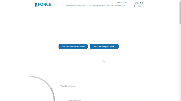
kforce.com
-
- On their main homepage, Kforce includes a subtle animation behind their positioning statement that includes their brand colors, with a quick transition fading from bright blue to moody gray. A strong and modern font, user-triggered animation buttons, and generous white space continues down the page, keeping users engaged and client and candidate sections organized. Using “solutions” related language as opposed to “staffing” across the site effectively represents Kforce’s problem-solving and result-driven mindset.
Infostretch
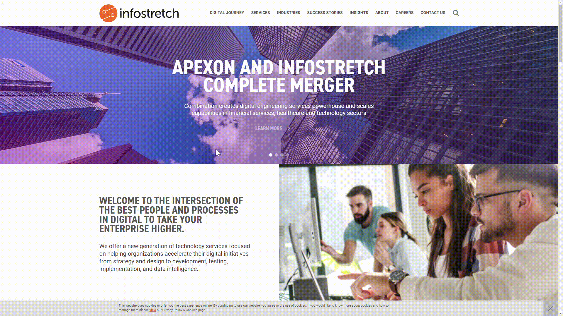
infostretch.com
-
- Infostretch makes a generous serving of information digestible with concise copy and well-organized menus. Strategic use of a people-focused video reel at the top of their home page beautifully ties in their brand colors of vivid pink, purple, blue, and orange. These creative pieces come together with bold typography and straightforward navigation to create a contemporary, entertaining user experience we expect is reflective of their culture and processes as a company.
Agilysis
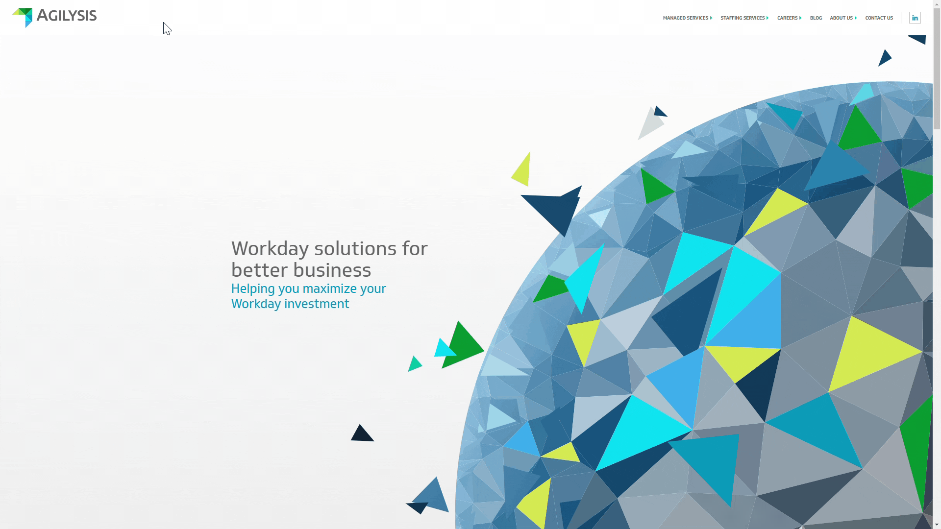
agilysis.com
-
- Brightly colored, amusing graphics are paired throughout Agilysis’s site with clean, easy to read text. On each page, you’ll find user-friendly menu options, making it easy for employees, candidates, clients, or any reader to find what they’re looking for.
CyberCoders
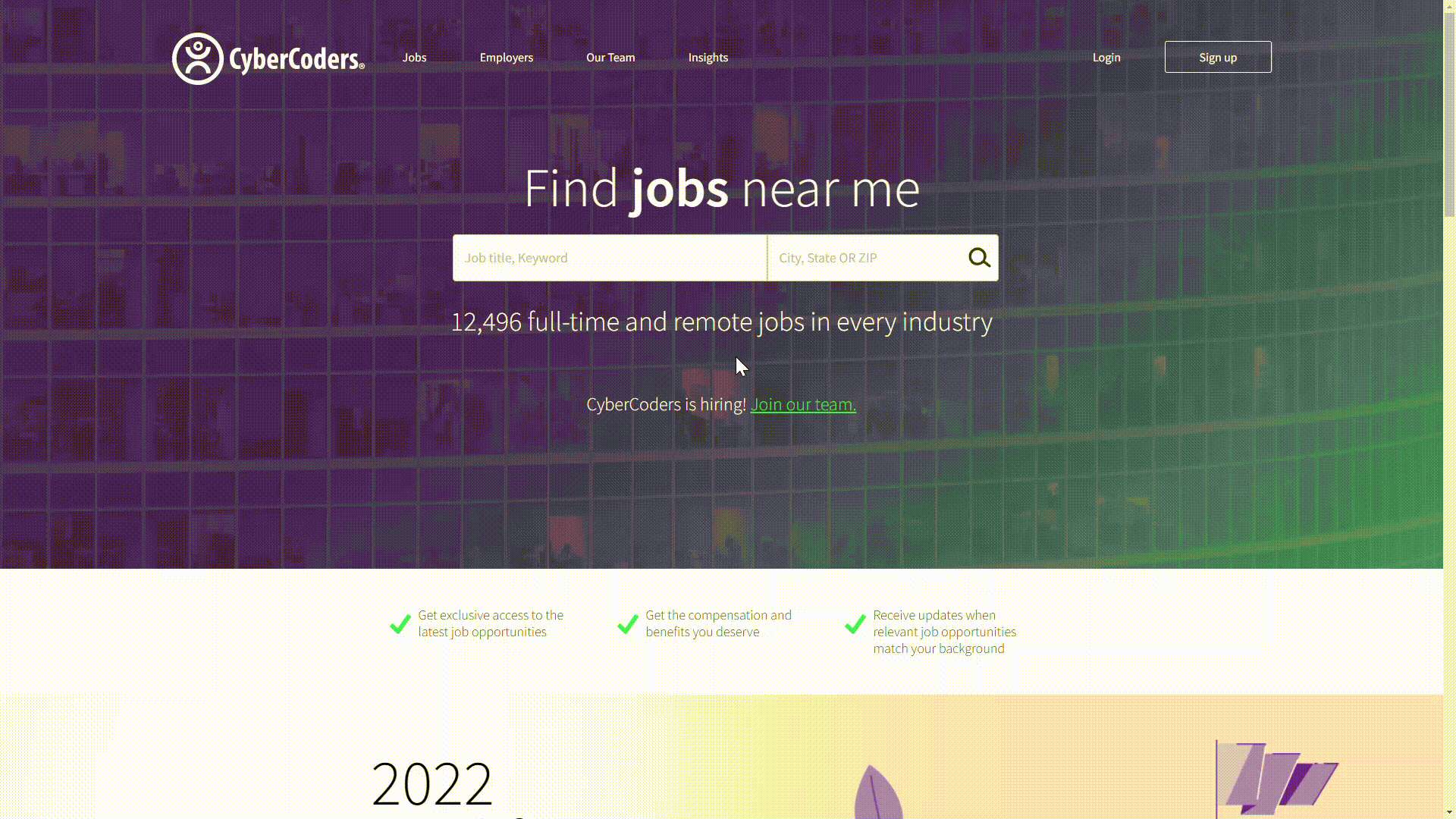
cybercoders.com
-
- The green and purple color scheme of CyberCoders’s site creates attention-grabbing contrast as it’s laid over the site’s white space and used throughout all graphics, buttons, and links. Their unique open job counter actively counts the open positions they’re looking to fill. With few animations and interactive features, users can focus on the main content of the site. CyberCoders proves less really can be more.
Business Centric Technology Corporation
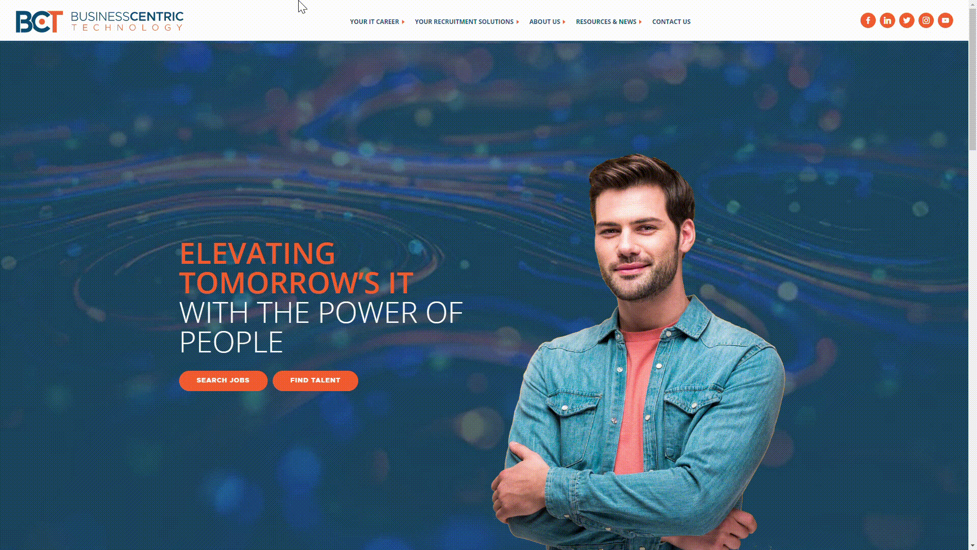
bct-corp.com
-
- Business Centric Technology Corporation (BCT) includes an eye-catching, unique video feed that continues down each page throughout their site and is layered under each topic section. As you scroll the site, you’ll find tons of interactive menu options and people-centric photos. With plenty of awards to show for it, BCT is a company focused on strong business solutions and harnessing the power of people.
Digital Prospectors
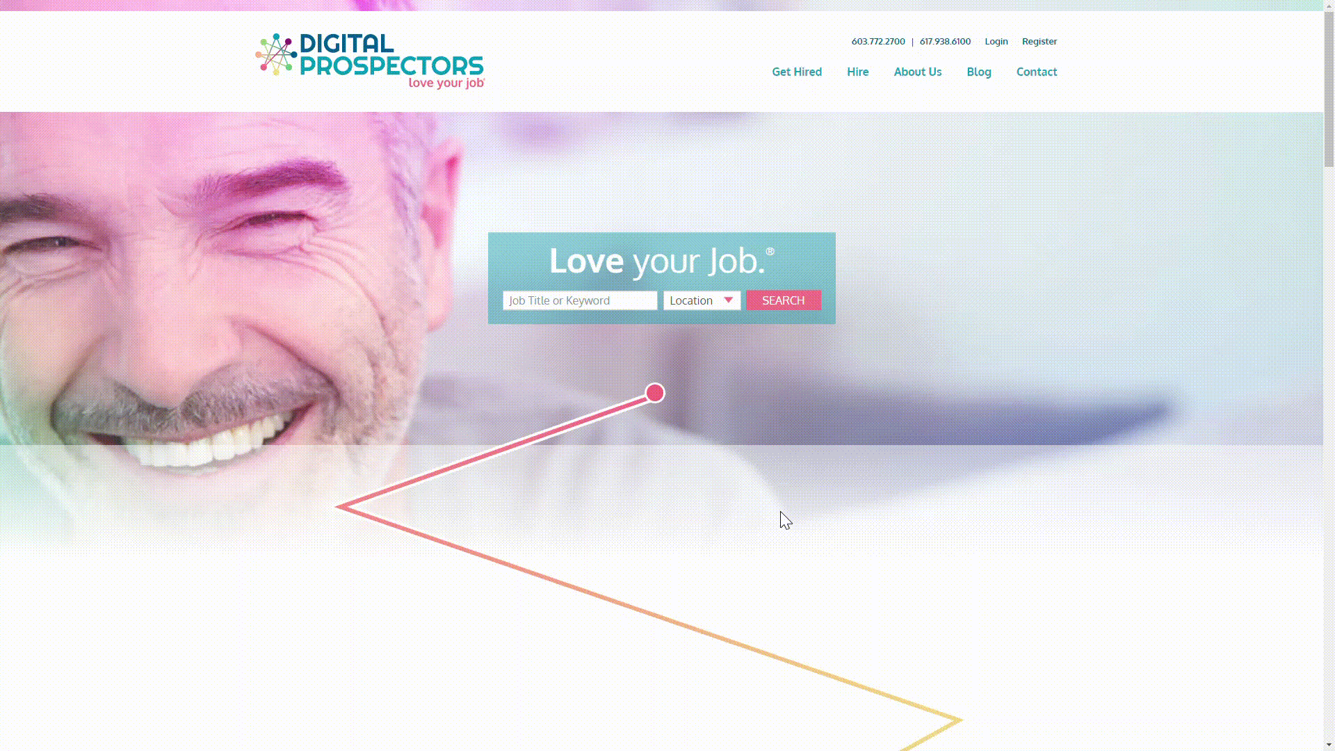
digitalprospectors.com
-
- Digital Prospectors does an amazing job at portraying their lighthearted, welcoming company culture through their website. Using colorful imagery and interactive buttons, a charming interactive graphical element that moves with you as you scroll down the page, and user-centric messaging, it’s obvious this company loves what they do and who they do it for.
DPProfessionals
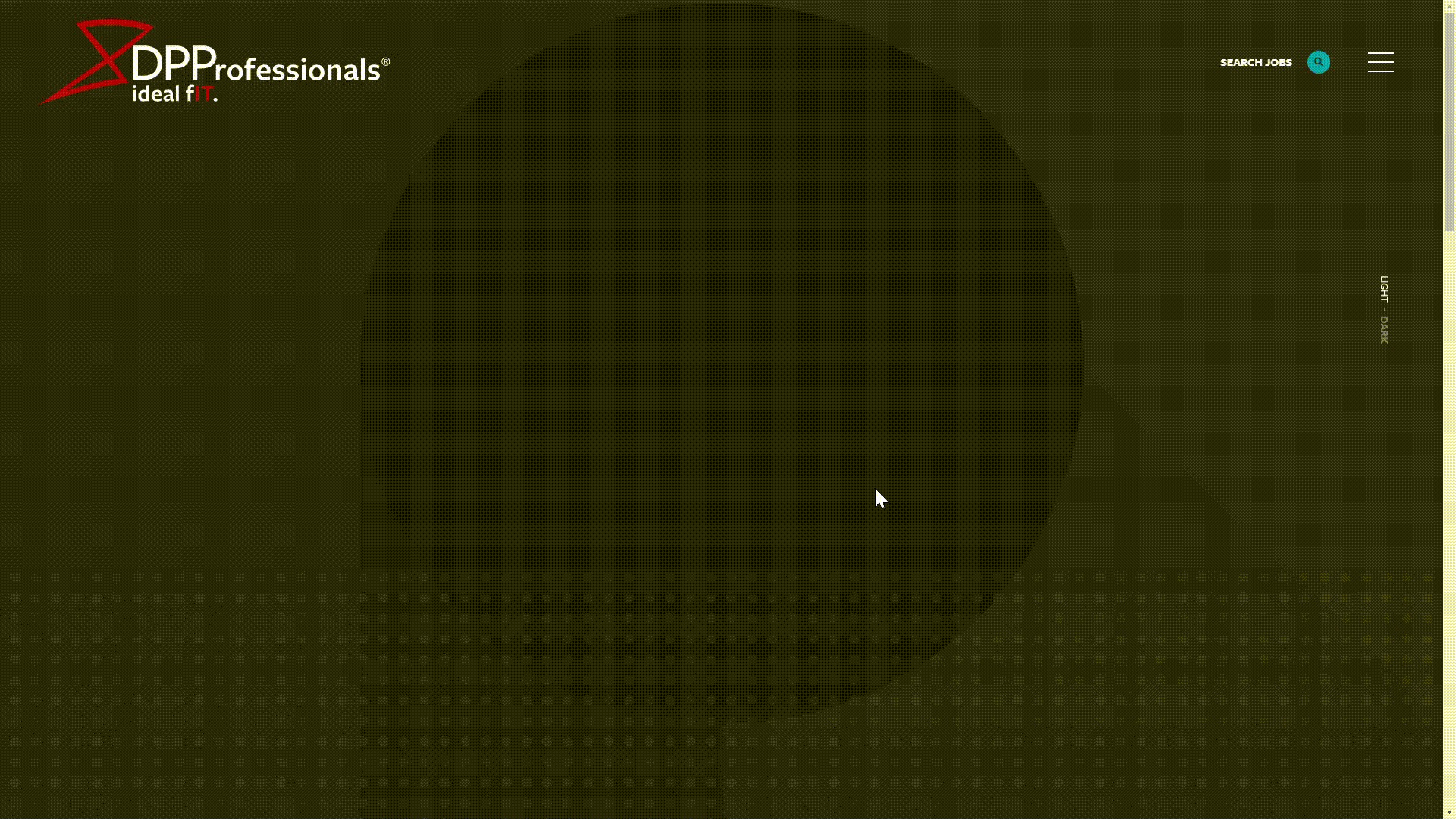
dppit.com
-
- Classic, clean, and professional are just a few words that come to mind when browsing the DPProfessionals website. Simple interactive buttons and clear, succinct messaging evokes feelings of honesty and humility, with the cheeky option to switch the pages from light to dark mode adding a bit of personality. A lack of images allows users to easily navigate the site with minimal distractions—this design choice makes it clear that the words throughout the site are most important.
Resource 1

resource1.com
-
- Resource 1 uses a beautiful photo of downtown Chicago on their homepage that plays on their logo colors of blue and green. With straightforward menu options right in the middle of the photo, they make it easy for users to navigate their site. As you browse the site sections, you’ll find a balanced use of white space, audience-centric photography, and professional headshots of their team.
ATR International
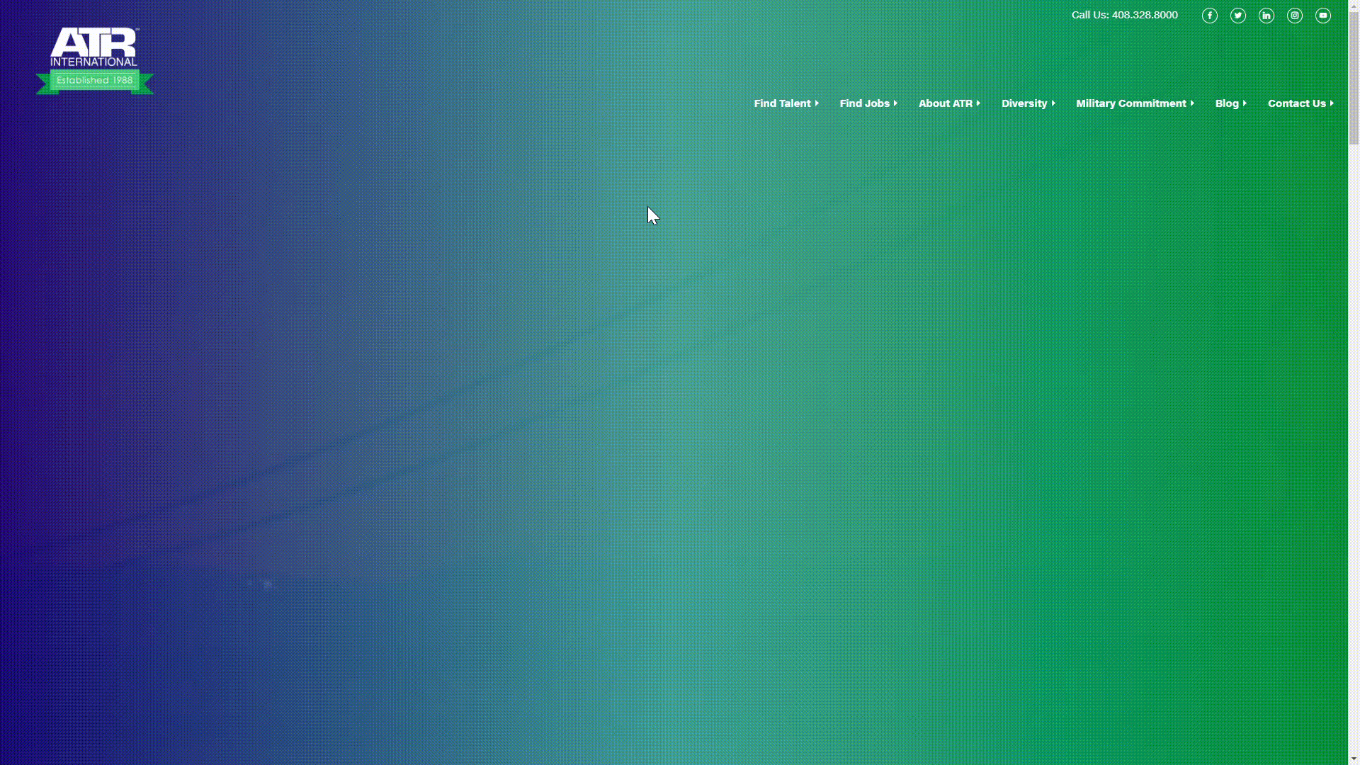
atrinternational.com
-
- Using their branded colors and a simple video backdrop, ATR makes it easy for both sets of their audience to get where they need to be. On every page you’ll find engaging graphics, clean white space, and photos representative of their focus on relationships.
iSphere

isphere.com
-
- iSphere’s simple yet enticing animation reflects the spherical nature of their company name and branded colors. Using catchy copy, tech-related imagery, and well-organized menus, iSphere’s site represents their fun, professional workplace culture well.
2nd Annual Winners
Brightwing
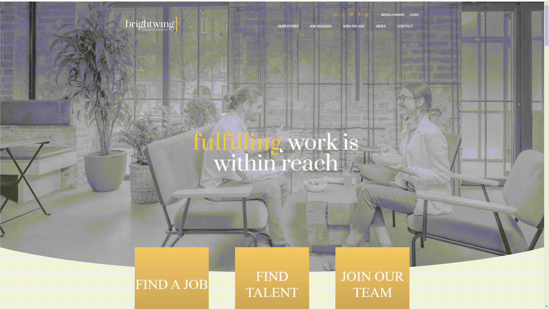
gobrightwing.com
-
- Brightwing has made successful updates to their website since last year. While they still include a beautiful pairing of serif and sans serif fonts, they’ve swapped the videography for still black & white images and ample white space. This change allows the messaging and graphics across the site to stand out.
MindSpring
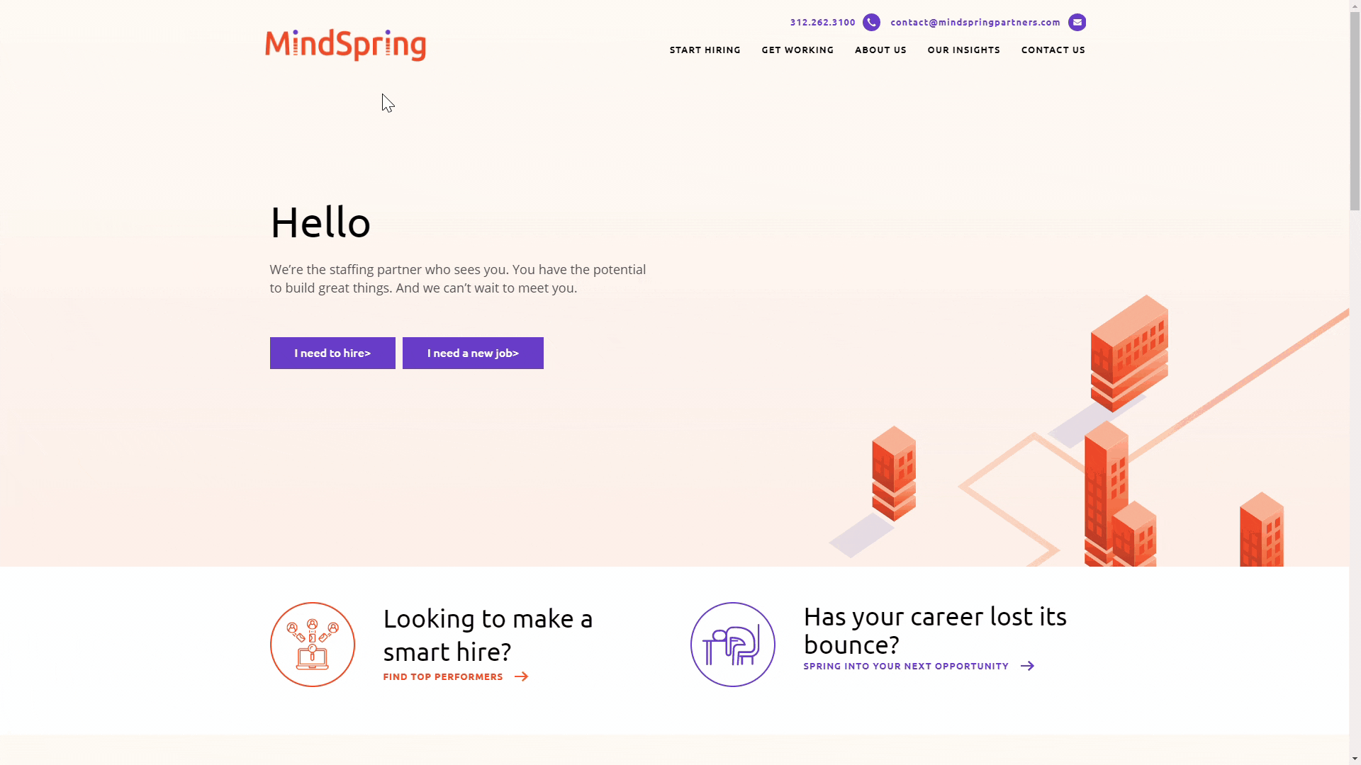
mindspringpartners.com
-
- We’ve chosen MindSpring again in 2022 for their whimsical animation, branded colors, and intentional web copy that offers a unique user experience, serving as a digital introduction to their playful culture, authentic values, and great people.
Addison Group
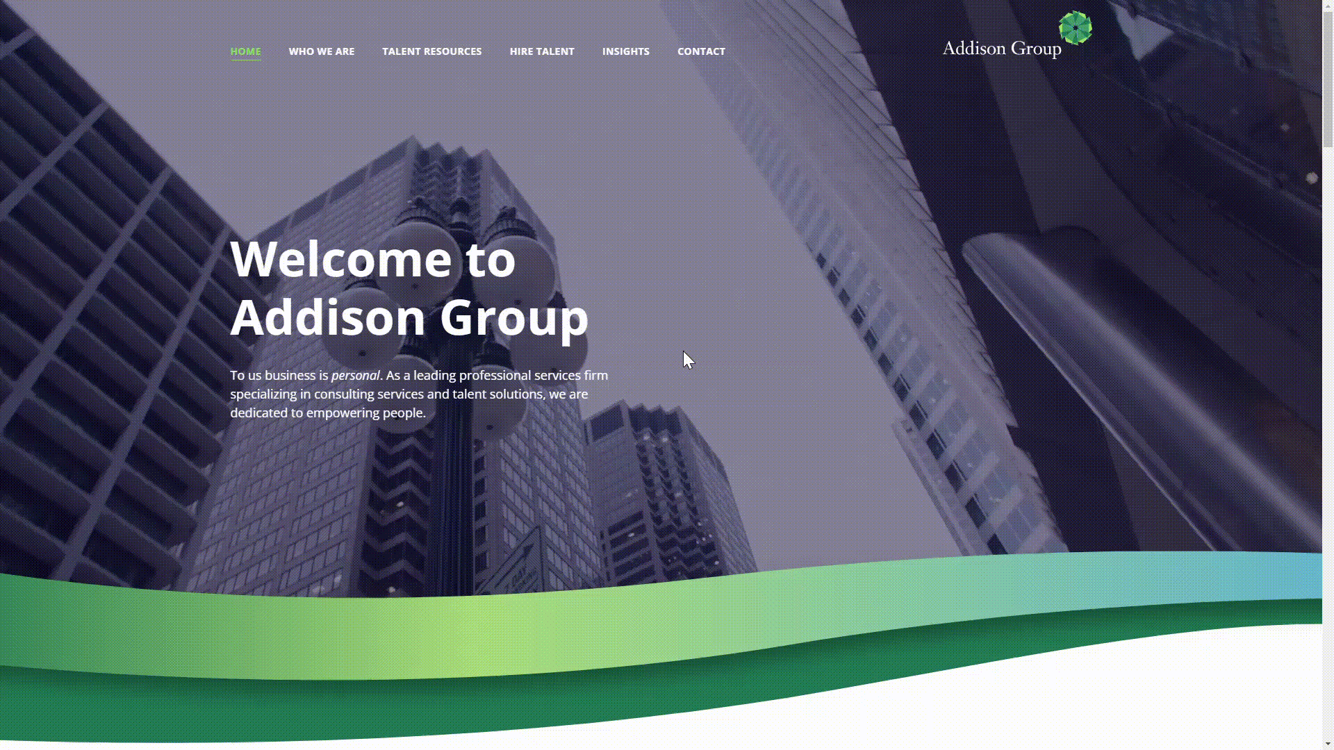
addisongroup.com
-
- Another 2021 winner, Addison Group has also added a layer of customer centricity with a camcorder-style video of their staff. Their people-first messaging comes through with clips of employees chatting, laughing, and high-fiving. Their menu has also been moved to the header, giving all the attention to their new video, and simplifying site navigation.
The Planet Group/WinterWyman
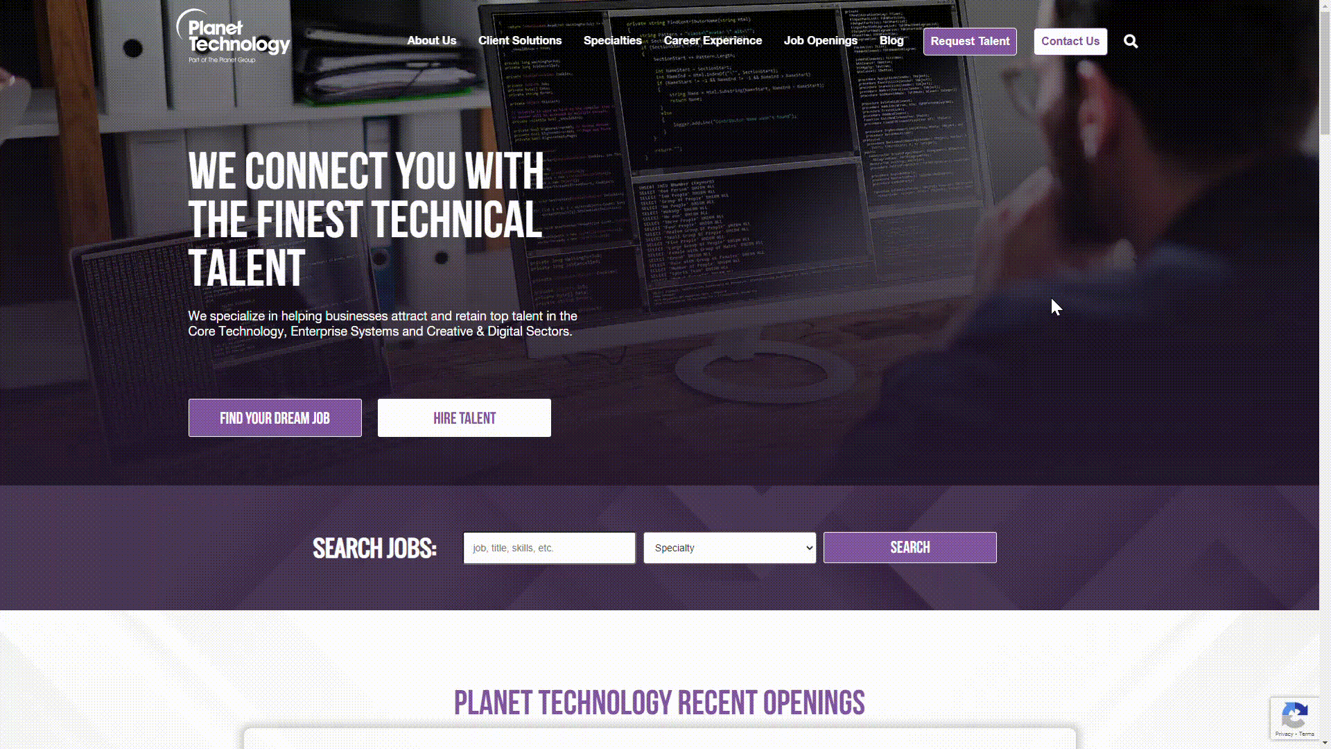
planet-technology.com previously WinterWyman
-
- WinterWyman, who was on our 2021 list, was acquired by The Planet Group, becoming Planet Professional and Planet Technology. Here we’d like to include Planet Technology in our 2022 list. Their new site is reminiscent of a company that strives for excellence and professionalism. With tech-centered imagery, a beautiful layout, and easy-to-navigate menu options, there’s no doubt Planet Technology is an expert in the IT industry.
Collabera
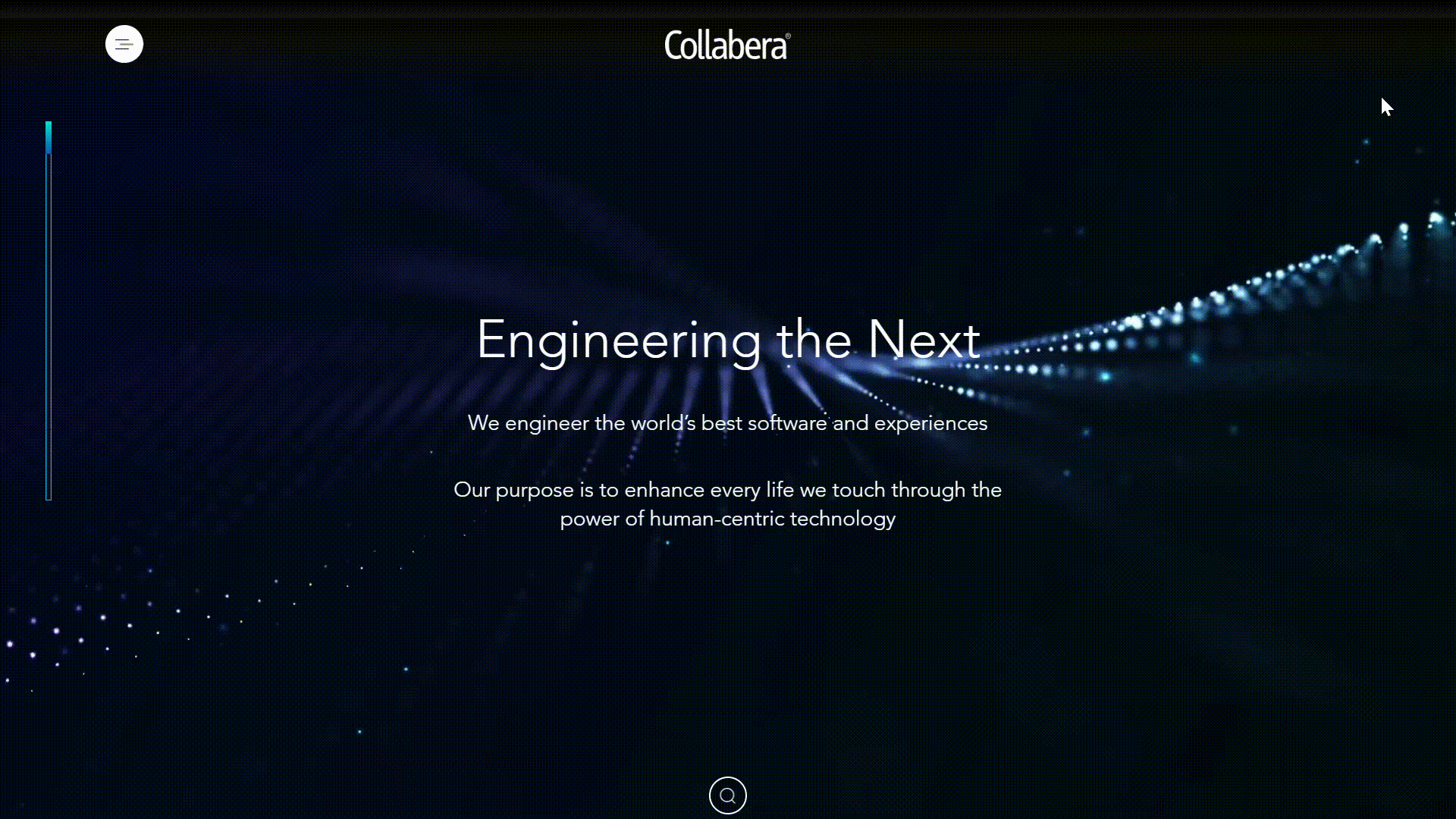
collabera.com
-
- Finally on our list of previous winners, Collabera also had a major site redesign. They updated their homepage from a people-focused photo collage to a dark, modern animation with soft flashing lights. With the added transparent menu and a circular cursor that inverts the colors it passes over, Collabera successfully highlights their status as a tech-forward business.
Ready to redesign your staffing website? Get started now!
We hope these examples gave you inspiration for your own IT staffing website! We’d love to learn more about what you’re looking for.
See our top staffing websites of 2021 here.